5085 26
SEO 20 min read August 12, 2022

Mobile SEO: How to Get the Most Out of It?

Mobile SEO: How to Get the Most Out of It?
For some time now, mobile search has dominated the search world, and it is bound to peak soon. Why is that?

Comparatively to desktop computers, handheld devices are more likely to conduct local searches, seeking more accurate information specific to their location. Everyone wants to find relevant info as soon as possible. This is what makes mobile phones so much appreciated: you can access particular data you need in just a few clicks.

All of these facts are quite obvious, but the question is what do site owners have to pay attention to when optimizing their sites for mobile search?

We decided to discuss the most common questions that arise when dealing with mobile SEO. That's what you'll read about in this post.
Today’s article will be supplemented by the comments of the following experts from our Twitter Chat:
Jono Alderson
Digital strategist. Marketing technologist. Full stack developer.
Head of SEO at Yoast
Olena Prokhoda
Social Media and Community
Specialist at Serpstat
Joseph S. Kahn
President of Hum JAM
PraveenKumar Yadav
Performance Marketing &
SEO Analyst at Easebuzz
Joey Trend
Co-Founder of Hum JAM
Taylor Murchison
SEO at Tipalti
Amal Ghosh
Passionate About SEO & Writing
Lui Slauco
SEO Specialist

1. Mobile Optimization in a Mobile-First World

Mobile optimization is a crucial aspect of any marketing campaign that seeks to increase a brand's visibility. Basically, it is a strategy for updating a website to deliver a mobile-friendly experience to its visitors. Content that is truly optimized should deliver engaging experiences on both desktop and mobile devices.

One may wonder why mobile optimization so much matters in today's mobile-first world. Pew Research Center on the Internet and Technology reports that Americans, for example, are increasingly mobile. Take a look at these mobile usage statistics:

  • 96% own a cellphone;
  • almost three-quarters own a desktop or laptop computer;
  • nearly half own a tablet/e-reader;
  • and approximately one in five Americans use a smartphone as their primary device for connecting to the Internet.

Obviously, almost everyone you want to reach has a smartphone. This is a fact that can't be neglected.
Statista shows that 60% of organic searches come from smartphones. Google statistics show in recent years, mobile searches for the term “best” went up by over 80% in 24 months. Consumers are more likely to click the link out the correct search terms to lead them to you.
PraveenKumar Yadav
PraveenKumar Yadav
Performance Marketing and SEO Analyst at Easebuzz
So, is "mobile optimization" still the right way of thinking in a mobile-first world? Is a mobile-friendly content really matters today? Here are some thoughts from our experts. 
Many of you are reading this on your mobile device. Instead of looking at the device on which our content is being read, we should think about the person who is reading it and their experience.

Mobile-friendly content is now preferred by Google's algorithm. It now indexes mobile-first. Thus, in 2022, websites without mobile SEO are more likely to be overlooked by Google.
Olena Prokhoda
Olena Prokhoda
Social Media and Community Specialist at Serpstat
Once upon a time, we only had desktop sites. Then, we had to scramble to build mobile versions of our sites. We had mobile views, templates, and subdomains - and maybe even AMP pages - and used meta tags and canonical URLs to describe the relationships between them.

But that was always a bit messy, and overly simplistic. A mobile experience isn't always just a 'lite' version - sometimes, mobile experiences can (and often should) be richer than their desktop equivalents. But what even is a 'mobile' experience, nowadays?

We have 'mobile' screens which are larger than some desktops, whilst elsewhere we see a return to deliberately simplistic mobile interfaces. The range of device types here is vast. You don't know where your content will be consumed. Desktop. Phone. TV. VR headsets. Toasters?

So, how should we think about this? Well, Google is 'mobile-first', so that gives us some constraints. 'Mobile' is usually going to mean 'small screen' & limited real estate. So, what can you fit on a small screen? What do you show first? What might you re-order vs desktop?

You need to start with 'device-agnostic' optimization, then layer device-specific optimization on top of that. But you also need to maintain a reasonable degree of parity between experiences.

So if you're moving things around, or hiding things, you probably want to be doing that via CSS based on media queries, instead of changing the HTML or underlying structure. 
Jono Alderson
Jono Alderson
Head of SEO at Yoast
I agree that mobile should be first in design and UX needs, but should it really be first with searcher intent? Yes.

Why? Because these things are not only attached to us, but they guide our every decision. That's why all SEO decisions should start there.
Joseph S. Kahn
Joseph S. Kahn
President of Hum JAM
Desktop is dying, so optimizing for mobile is the only policy for now. Loading speeds for desktops isn’t difficult, it is for mobile.

Think from outside or inside the box for mobile optimization, the first time it got me and I failed, took two hours to figure out, and I got this:
Lui Slauco
Lui Slauco
SEO Specialist
mobile seo

2. Device-Agnostic Optimization

Apparently, there is an obvious explosion in mobile users who access the Internet. Today, one might think all web design should be approached device-agnostically.

A device-agnosticism is assimilated into the essential elements of responsive design. These terms both emphasize a device-centered approach rather than a user-centered approach. But instead of meeting the needs of the device, the user's needs should be prioritized. Don't you think so?

It is essential that optimization results from task and context analysis so that users receive the most relevant information. So a web design movie should be a story with content as the focal point and design as a supporting role.
We decided to discuss the most important things one should pay attention to when applying device-agnostic optimization. 
Every pixel counts, and first impressions count. Clarity of messaging and purpose is important. Performance is important. Make sure that you're only loading what you need, and you're doing it as quickly as possible!

Don't have a separate site, separate templates, or separate systems for your 'mobile site'. Have one single CMS and system, which serves the right content, to the right user, in the right format based on their device context and likely needs. Resist having different templates.

Tech for serving content device-agnostically has come along in leaps and bounds. There are APIs for, e.g. looking at device hardware capabilities, network connections, and more. And CSS can even target pixel densities and user preferences like dark mode or low animation!
Jono Alderson
Jono Alderson
Head of SEO at Yoast
The site needs to load quickly and provide easy-to-read information that people are looking for on any devices :)
Olena Prokhoda
Olena Prokhoda
Social Media and Community Specialist at Serpstat
In the world smartphone are keep changing model design for market penetrations is the same Device agnosticism, or device-agnostic, is the right way device component to work with various systems without requiring any particular adaptations.
PraveenKumar Yadav
PraveenKumar Yadav
Performance Marketing and SEO Analyst at Easebuzz
Interestingly enough, I usually let tools guide me in this category since the requirements seem to be constantly changing. Tools like Serpstat and Google Search Console do a great job pointing out issues.
Joseph S. Kahn
Joseph S. Kahn
President of Hum JAM
To find errors that hold your site back in one click, use Serpstat Site Audit tool. It performs a comprehensive analysis and scans websites for technical SEO issues.

This is exactly where you can get recommendations on improving site pages for computers and mobile devices.
get a personal demo Serpstat
Would you like to learn how to get the most out of Serpstat Site Audit tool?

Send a request and our expert will provide you with all the info needed! 
It's important to be mindful of what scripts are loading. While some apps/programs don’t add significant load time on desktop, they can wreak havoc on mobile.
Taylor Murchison
Taylor Murchison
SEO at Tipalti
Make sure you are not blocking JavaScript, HTML & CSS code.
The responsive design will be another area to keep in mind.
Amal Ghosh
Amal Ghosh
Passionate About SEO & Writing

3. Optimizing of Device-Specific Content

What's the biggest difference when it comes to optimizing for device-specific content?
Less is more. You can't rely on having a big homepage banner slider to convey 10 different marketing messages. You're going to have to make some sacrifices. That can be tricky! But for key content, landing pages and user flows, it forces you to laser focus on what matters.
Jono Alderson
Jono Alderson
Head of SEO at Yoast
Mobile devices and desktops differ in how people read.

The user is not very focused on certain parts of the screen, as it is on the desktop. This should be taken into account.
Olena Prokhoda
Olena Prokhoda
Social Media and Community Specialist at Serpstat
Rankings are influenced by factors such as operating system, site structure, page organization, and screen size. Search engine indexing and all the ranking processes differ between devices as a result of the interaction of these variables.

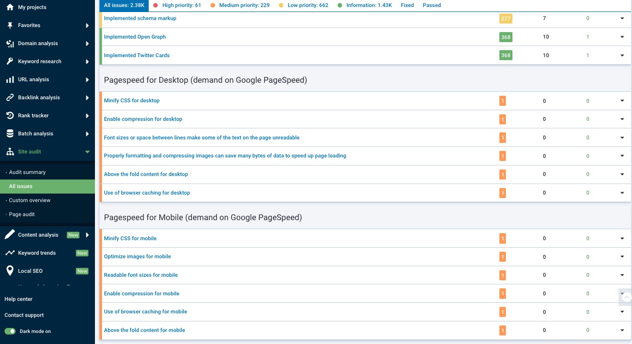
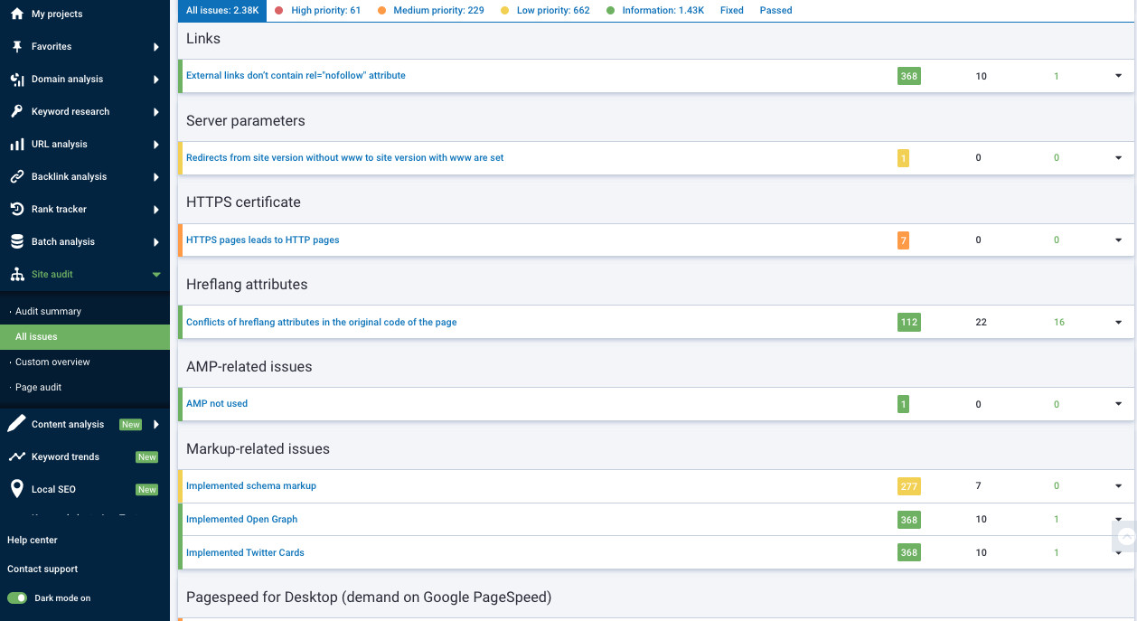
A mobile SEO strategy provides a framework for success on any device. But the first step is to understand the differences between desktop and mobile search results, as well as how the factors above impact search results:
A major difference between desktop and mobile SEO is the layout of the Search Engine Results Pages (SERP). Differences in screen sizes influence the way information reflects.
Location. Modern mobile phones are equipped with global positioning systems (GPS), which provide more accurate location data to Google than stationary desktop computers. That's why info may differ when using different devices.
The operating system of the phone also impacts mobile search results. Google is more likely to show an app pack that links directly to the app store if you search for something using a mobile phone. Desktop search results definitely will not show you such options at the very beginning.
It's a "left to right" and a "top to bottom" shift in all of your designs. As long as your tools let you go between devices, it makes it easier to achieve. But this also affects thinking, which can affect SEO. It goes into the formula.
Joseph S. Kahn
Joseph S. Kahn
President of Hum JAM
You may wonder what tools you can use to track your mobile rankings. This is where Serpstat Rank Tracker tool can assist. Use it to:

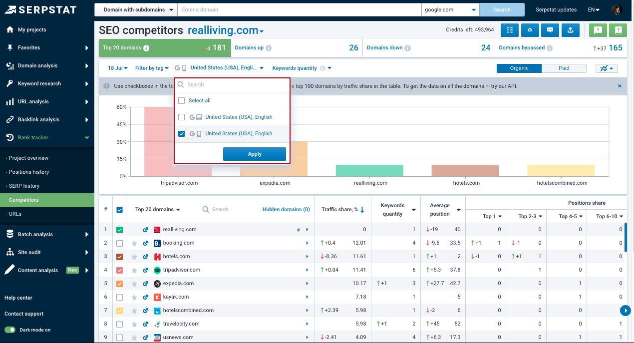
  • track your site's rankings for the desired keywords;
  • review the rank distribution history;
  • monitor organic traffic distribution between you and your competitors in the mobile search:
Check the search ranking for your website on desktop and mobile, compare it to your competitors, and find new possibilities to appear in search engine top results with Serpstat.
Want to learn how to use Serpstat tools to track your mobile rankings?
Leave a request, and our experts will advise you on the development of your project, share training materials, and offer test access to Serpstat!
Customers spend increasing amounts of time exploring types of content on mobile. Use a responsive template for everything Use Accelerated Mobile Pages (AMP) light-weight web pages that create fast mobile experiences. Check mobile SERP layout, and mobile optimization.
PraveenKumar Yadav
PraveenKumar Yadav
Performance Marketing and SEO Analyst at Easebuzz
Let's think effectively together :)

Join our #serpstat_chat!

Join #serpstat_chat to discuss the questions of practical SEO, trends, and updates with SEO experts.


We conduct them every Thursday at 2 pm ET | 11 am PT on our Twitter channel by hashtag #serpstat_chat.

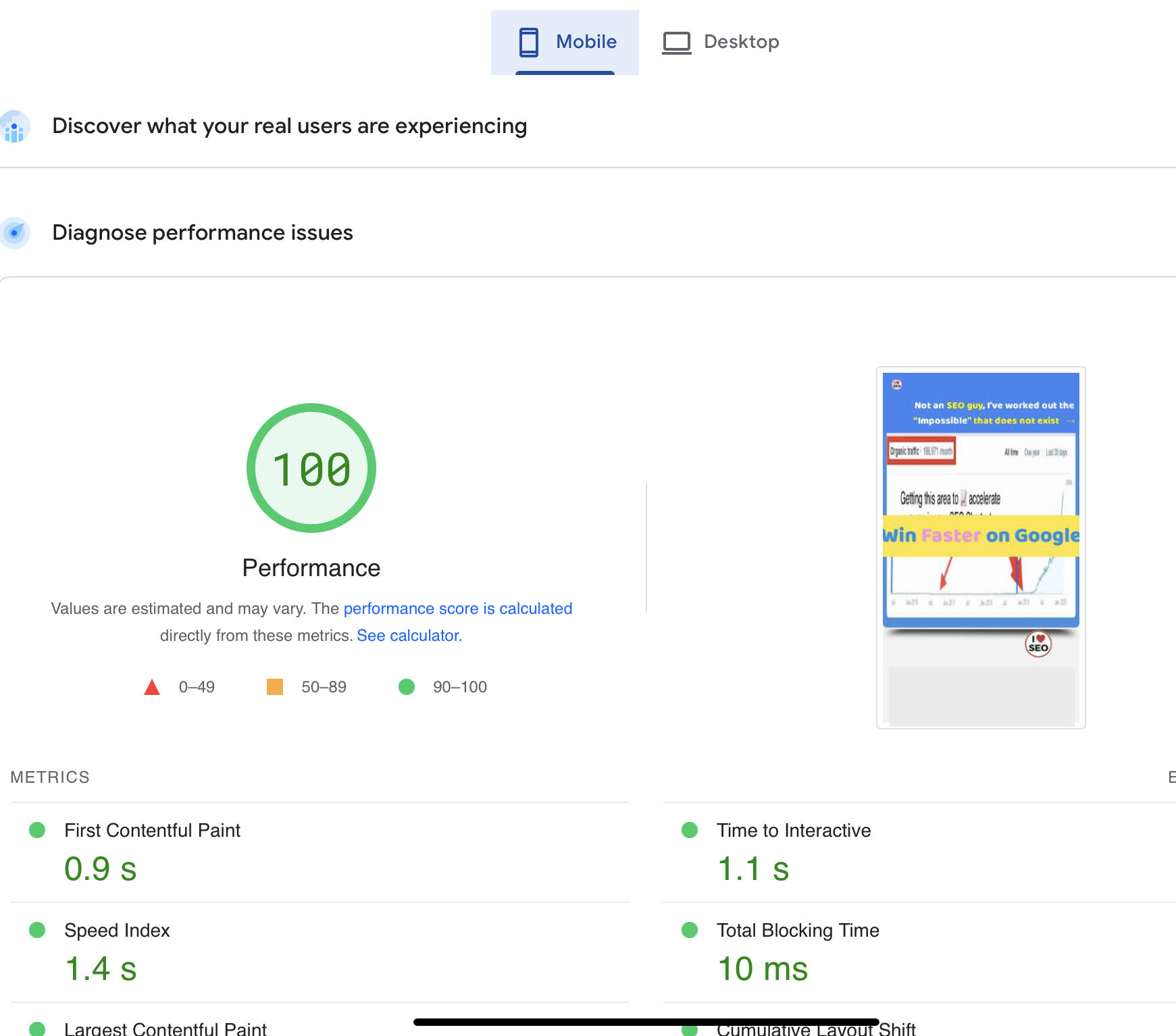
4. Speed & Performance Optimization

Let's wonder, what's the easiest thing that people can do when it comes to speed and performance optimization?
Upgrading your hosting service. However, if you got bad code that can really hurt you as well. Either throw money at the problem or get down and dirty with the technical aspects of your website.
Joey Trend
Joey Trend
Co-Founder at Hum JAM
I am sure others will beat me to this answer, but I always start with the images and their load on the pages. That fixes a ton when you optimize these.
Joseph S. Kahn
Joseph S. Kahn
President of Hum JAM
Reduce # of scripts loading. Obviously, there are some that are necessary. But if you have scripts loading that aren’t being utilized, that’s an easy win to remove them.
Taylor Murchison
Taylor Murchison
SEO at Tipalti
There are a lot of factors to consider when improving site performance, especially with a variety of devices and operating systems.

But if your business relies heavily on its website as one of the main channels for reaching customers, you should make the most out of them, taking into consideration different points:
switch from HTTP to HTTPS;
optimize images (alt tags and sizes);
write mobile-first code;
choose the right hosting service plan;
reduce the number of plugins;
minify and combine CSS, JavaScript, and HTML files;
use website caching;
adopt cloud-based site monitoring, etc. 

5. Mobile SEO Perspectives

We've gone from desktop sites, to separate mobile sites, to responsive sites. What's next?

Let's see what points of view our experts have regarding this question. Experienced SEO Specialist Lui Slauco highlights the following techniques:
  • optimize all images, even the smallest ones;
  • open up smaller CSS, java scripts and limit them to just a few;
  • have the right font family, as some load faster than others;
There are other factors, but these are the easiest.
Lui Slauco
Lui Slauco
SEO Specialist
There are some safe assumptions here. We're getting better controls in the browser for recognizing device properties and network conditions - like low RAM, or old GPUs. More controls bring more flexibility, without needing to build completely different templates/systems.

So the best bet is to build something 'upwards' from the smallest possible viewports and components. Layer in additional functionality only when you know that it makes sense for the consuming device. Separate your content from your presentation, and adapt CSS/JS as necessary.

Of course, that's a luxury you'll only have if you're starting from scratch. If you have an existing setup, the thing you can bet on is that it'll be valuable to start pulling that apart into smaller pieces. See if you can gradually make device-specific logic more flexible!

E.g., avoid using CSS media queries that target specific breakpoints, and instead use logic based on responsive layouts. Modern CSS and JS make this easy and versatile; responsive font sizes, automatically adjusting layouts and similar are very easy to implement on any site.
Jono Alderson
Jono Alderson
Head of SEO at Yoast
The only way to make the right bet is to follow the herd.

Where are your customers going in terms of technology? What do they use? Follow them. Follow your target's socials to see what they are using and put up a testing lab to get ahead of the curve.
Joseph S. Kahn
Joseph S. Kahn
President of Hum JAM
People looking for an estate attorney aren’t doing it on mobile. And kids looking for toy review videos aren’t doing it on desktops. Plan accordingly, that's all. 
Taylor Murchison
Taylor Murchison
SEO at Tipalti

Key Takeaway

We hope you'll find all the recommendations discussed in our Twitter Chat helpful when optimizing your site for mobile search.

So, make sure your website is well-structured, responsive, and mobile-friendly; don't forget to take all necessary security measures and create content that will provide users with valuable data in the 'easy to navigate' form.
Join our private Facebook group Serpstat Insights to get read follow-ups with all the info discussed in Twitter Chat!
SEO, PPC, Marketing, and everything related to this area are discussed in depth here. 

Learn, succeed, and share your experience in this group: discuss network with other Serpstatmates, and contact our dedicated customer support representatives. Get the latest product updates and industry news here!

We’re sure you’ll love our little community as much as we do! 
Looking forward to interaction :)
To stay up to date with all the news from the Serpstat blog, subscribe to our newsletter. Also, follow us on Twitter, LinkedIn to get all the insights!

Speed up your search marketing growth with Serpstat!

Keyword and backlink opportunities, competitors' online strategy, daily rankings and SEO-related issues.

A pack of tools for reducing your time on SEO tasks.

Get free 7-day trial
The opinion of the guest post authors may not coincide with the opinion of the Serpstat editorial staff and specialists.

Rate the article on a five-point scale

The article has already been rated by 5 people on average 5 out of 5
Found an error? Select it and press Ctrl + Enter to tell us

Discover More SEO Tools

Backlink Cheсker

Backlinks checking for any site. Increase the power of your backlink profile

API for SEO

Search big data and get results using SEO API

Competitor Website Analytics

Complete analysis of competitors' websites for SEO and PPC

Keyword Rank Checker

Google Keyword Rankings Checker - gain valuable insights into your website's search engine rankings

Share this article with your friends

Are you sure?

Introducing Serpstat

Find out about the main features of the service in a convenient way for you!

Please send a request, and our specialist will offer you education options: a personal demonstration, a trial period, or materials for self-study and increasing expertise — everything for a comfortable start to work with Serpstat.

Name

Email

Phone

We are glad of your comment
I agree to Serpstat`s Privacy Policy.

Thank you, we have saved your new mailing settings.

Report a bug

Cancel
Open support chat
mail pocket flipboard Messenger telegramm