The Psychology Behind Engaging User Experience

Larry Reed
There's a very tight and important relation between psychology and web design. Psychology, as a science that studies the behavior of human mind, can help designers in a multitude of ways. After all, web design is not done for the purpose of its own aesthetics or for the designer's sake, but for users.
Web browsing psychology
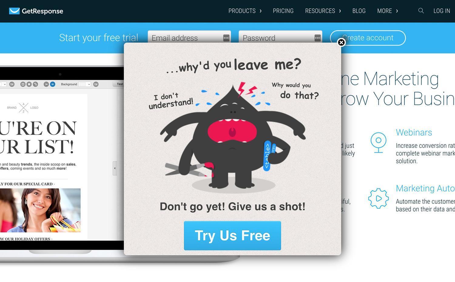
GetResponse Popup
If we take a look at this funny-looking popup from GetResponse, it is clear that they are using emotions to lure users into trying their tool, free of charge. One might think that free stuff gets clicked on anyway, but this is not entirely true in the current competitive landscape. GetResponse here resorts to showing us a caricature of their mascot crying while seeking to get us to try the tool before we bounce off the page. Let's dig a little deeper.
To fully understand a specific type of online behavior we need to look beyond everyday human needs and desires and go a little deeper. Often we can trace the reasons for specific user behavior back to basic psychological or even evolutionary concepts. For instance, it's bad if your site leaves an impression on users that they're not in the control of the situation.
Normally, we feel as if we're in control of things as long as our expectations about them are fulfilled. But as soon as something unforeseen happens, there can be a feeling of discomfort or even fear, deeply rooted in our brains since the prehistoric times. The times when any unexpected event could bring serious danger or death.
How does this fact correspond with web design? Well, what used to be a dangerous carnivore in front of the cave today has its equivalent in pop-ups or self-playing videos. A very subtle and rudimentary feeling of fear and danger occurs when a video you haven't clicked on starts playing and completely messes up with your expectations. And the effect is roughly the same as with the carnivore they will chase people away. In this case, chase them away from your website.
Lack of control can also be experienced if the user feels lost on a page, whether because of bad navigation or articles that seem too long. Whenever this happens, it's vital to have in mind that it's not the user's fault, but designer's, and that websites should adapt to people, not vice versa.
Why users blame themselves for bad UX
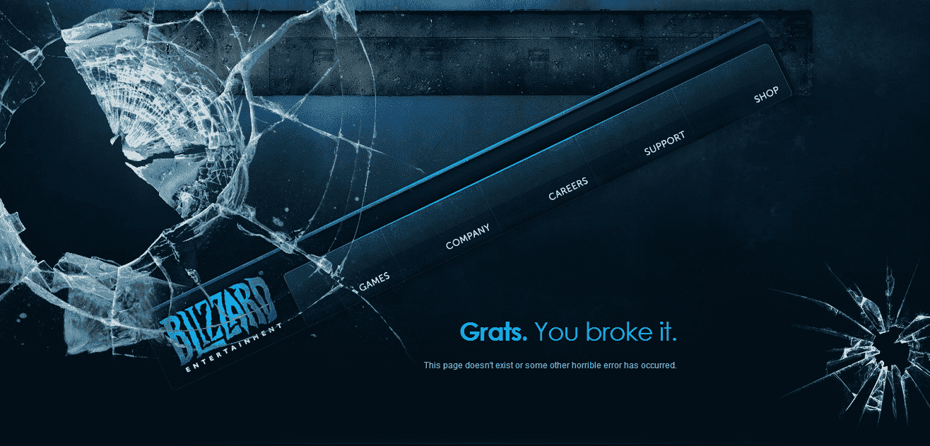
Blizzard Entertainment 404 page
This screenshot from the Blizzard website clearly makes fun of the fact that users blame themselves for certain software malfunctions. This is their 404 page which says: "Grats. You broke it." While Blizzard is teasing their users in a funny way, the fact remains that the company itself is to blame for the missing page.
However, too often, users do blame themselves if they can't find their way around a website. There are a few reasons to this, most notably the concept of taught helplessness and the aesthetic-usability effect. The "taught helplessness" in this case refers to a common person that's not too knowledgeable or experienced in technology. Now, if this person failed to perform some technology-related tasks in the past, they will be inclined to blame themselves for every technological failure they come across in the future. The aesthetic-usability effect simply means that an average person, when facing a good-looking, aesthetically appealing device or design, automatically assumes that it works properly as well.
Of course, this is not the case. Consequently, many of the top website design and development agencies are working hard on humanizing their design and making it more user-centered. Let's check out a few concrete examples of how this is done.
Changing user behavior with UX psychology
There are many common design tricks that make use of psychology to provoke desired user behavior. They are based on principles like framing, scarcity or social proof, just to name a few. To give you an example of how this works, we'll have a brief look into two ways the user behavior can be changed by clever design – choosing the right colors and applying appropriate shapes.
Using color to influence emotion
Even a novice designer knows that every color evokes a certain emotion or mood. According to a study, suitable colors can increase brand recognition by 80 percent. Red highlights a sense of importance and the conflicting emotions of love and hate. Overusing it may cause the feeling of stress and tension. But using it the right way can do wonders for UX. But site owners and designers need to think about color psychology.
For example, light red symbolizes youth, while dark red reminds us of strength and maturity - such as a brick wall. Since red is a dominating color, it raises our awareness levels and gets our blood running. Therefore, it should be used accordingly. Bright red can be used to divert the users' attention toward an important part of the page, while dark red can be used to instill a sense of trust into the users, which in turn increases engagement with the brand.
Yellow, for example, reminds people of sun, pleasure, and happiness, and thus generally helps inducing the feeling of peace. This is especially important for pages that are filled with various buttons and might appear complicated to the average user. Yellow can be used to relax users into interacting with the website elements without the immediate fear of potentially getting lost in the interface.

Performable CTA experiment
So how can you use color to your advantage? There are endless ways to do this. Let's just mention one example - changing the CTA button from green to red can increase your CTR by 21 percent. In this experiment, Performable measured the CTR of a green CTA button and that of a red one.
Both page designs were absolutely the same, except for the color of the CTAs. Due to the power of the color red, or to Performable audience's preferences toward that color, the CTR increased by 21 percent. But this does not mean that site owners should change all the colors of their CTAs. The best practice is to do what the team at Perfombale did - run tests and experiment with color choices until you find what resonates with your audience the most.
Both page designs were absolutely the same, except for the color of the CTAs. Due to the power of the color red, or to Performable audience's preferences toward that color, the CTR increased by 21 percent. But this does not mean that site owners should change all the colors of their CTAs. The best practice is to do what the team at Perfombale did - run tests and experiment with color choices until you find what resonates with your audience the most.
The influence of shapes
Web designers use shapes to organize information, direct user behavior, symbolize particular ideas and stimulate emotions. For instance, circles symbolize perfection and completeness, while rectangular shapes represent order, rationality, and solidity. Triangles, depending on their orientation, can stand for durability and strength on the one hand, or conflict and instability on the other. In any event, they might be useful if you employ them to direct user's movement on the page by pointing to the desired location.
Other that circles, triangles, and rectangles, web designers use more complicated shapes as well, such as spirals, natural shapes, and abstract shapes. Spirals are often seen in nature, e.g. in seashells or flowers. Spirals carry their own symbolic meanings too, as they usually represent intelligence, growth, creativity, and calmness. Designers can use spirals to divert users attention to the center of the shape, while at the same time making the user feel elevated.
Designers find inspiration in natural shapes too, such as flowers, clouds, animals, etc. When using these shapes in web design, designers create an organic, familiar and a refreshing atmosphere for the users. They make the online experience seem more natural. While there are countless natural shapes to choose from, it is best to rely on symbolism. For example, a shape of a lion can inspire bravery and fearlessness. Sometimes, designers want to make the users take a risk by performing a certain action on a website, so helping the users out with some suggestive nature symbols just might do the trick for those that are most reluctant.
Take for example this front page. This agency used geometry to boost their creative potential as a digital agency. The bird, also made out of shapes, symbolizes freedom. By looking at this website design, we might conclude that this digital agency might be willing to take creative risks, is different than all the others, has a more creative and free approach to design. Their front page design invites us to explore more, it is intriguing and mystical, but at the same time breathes originality, thus assuring us they can achieve technical perfection. But what about the users that cannot discern quality from generic design? What makes them click?
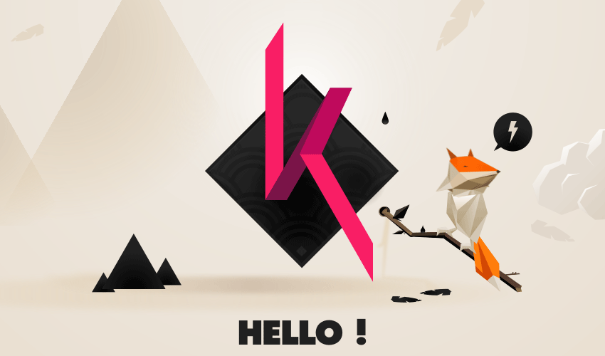
Digital agency Akaru - use of geometry
Intrinsic and extrinsic motivation
In psychology, motivation has the quality of being external (extrinsic) or internal (intrinsic). What makes users click through a website or an app is actually a combination of these two types of motivation. For example, reluctant users will become more reactive if the website or app design itself invites them to interact with it through the use of clever design tricks.
Apps or websites that use gamification as a way of interaction can be very successful in engaging their users. For example, today we see a lot of websites with user-generated content. Designers make use of extrinsic motivation to get users to create content by giving them rewards and letting them earn credibility within a community of other users. Quora is a great example of using extrinsic motivation to entice users to answer questions. Most active users earn a high-level of authority within the community and thus get recognition, respect, and a chance to make lasting connections. But sometimes external rewards are not enough.
Apps or websites that use gamification as a way of interaction can be very successful in engaging their users. For example, today we see a lot of websites with user-generated content. Designers make use of extrinsic motivation to get users to create content by giving them rewards and letting them earn credibility within a community of other users. Quora is a great example of using extrinsic motivation to entice users to answer questions. Most active users earn a high-level of authority within the community and thus get recognition, respect, and a chance to make lasting connections. But sometimes external rewards are not enough.
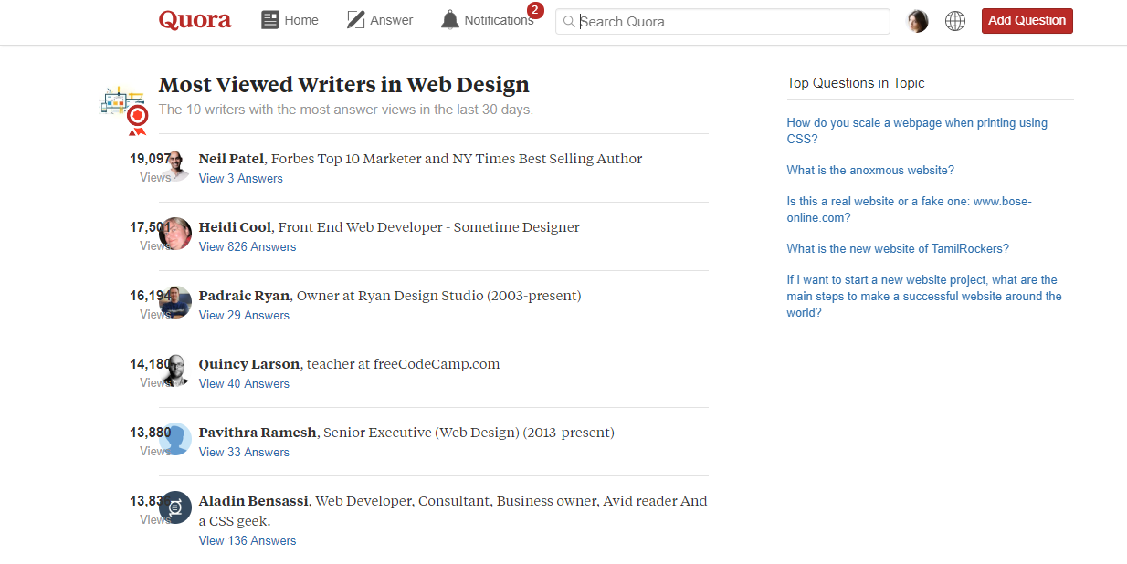
Internal or intrinsic motivation cannot be influenced by simple rewards such as having 5 stars next to your profile pic or just by moving up within the community. For users that don't require external motivation, giving it to them is what is in psychology called overjustification. But Quora has an answer for that too. Simply, users that are already college professors or knowledgeable individuals can be handpicked by the community and usually receive more feedback than the users that are, e.g. amateurs in their fields. So advanced Quora users enjoy a certain level of respect, which makes them answer community questions.
Summary: psychology and web design
Analyzing all the psychological aspects of web design that affect user experience would be too ambitious for a single blog post. Some things seem trivial at the first glance but can have a significant influence on how your visitors feel and behave.
In general, web design should be respecting the principles of order and hierarchy, but these terms can have different meanings for different people. This means that getting to know your target audience is vital. Whichever way you put it, there's no single particular formula for success. You need to analyze your visitors carefully, get into their minds and try to figure out how to deliver the most pleasant possible experience to them.
In general, web design should be respecting the principles of order and hierarchy, but these terms can have different meanings for different people. This means that getting to know your target audience is vital. Whichever way you put it, there's no single particular formula for success. You need to analyze your visitors carefully, get into their minds and try to figure out how to deliver the most pleasant possible experience to them.
Found an error? Select it and press Ctrl + Enter to tell us
Discover More SEO Tools
Domain Analysis Tools
SEO Domain Analysis – gain insights into your website's strengths and weaknesses
URL Inspection Tool
Uncover hidden SEO opportunities with our powerful URL Inspection Tool
Keyword Rank Checker
Google Keyword Rankings Checker – gain valuable insights into your website's search engine rankings
Competitor Website Analytics
Complete analysis of competitors' websites for SEO and PPC
Recommended posts
Cases, life hacks, researches, and useful articles
Don’t you have time to follow the news? No worries! Our editor will choose articles that will definitely help you with your work. Join our cozy community :)
By clicking the button, you agree to our privacy policy.