Start Exploring Keyword Ideas
Use Serpstat to find the best keywords for your website
SEO Web Design: A Guide For Designers


Design and SEO go hand-in-hand – here's why and how you should build SEO best practices into your work. Web designers who 'get' SEO will ultimately make more profitable and more successful websites.
- What is an SEO in web design?
- How search engines work – and why it matters for design
- Common SEO mistakes designers make
- It's not just about Google – it's also about users
- Website navigation best practices
- Site structuring
- Mobile-friendly design is a must
- Useful SEO tools for designers
- FAQ. Common questions about web design
What is an SEO in web design?
Using correct web page structure, adding HTML tags in the right order, with recommended number of symbols and many other things that web designer could do are highly appreciated by search engines.
How search engines work – and why it matters for design
As a web designer, it's important to have a solid grasp of how search engines actually work if you want to get the best results for your clients. Your decisions have an impact. When you know how they work, you can do your best to build a website that'll be easy for search engines to understand.
Search engines must be able to 'read' a website to understand the content and rank it accordingly. Presenting a website in the most SEO-friendly way takes some planning – it requires a structured approach that makes sense for the business and its products or services.
The way that you set up the website from an architectural point of view will impact how well the website database and content can behave from a search perspective.
You need to implement a website design that's:

Common SEO mistakes designers make
Headings – I'm talking about H1s, H2s, and H3s. It's quite common to see a web page with several H1s – or none at all. Designers often come at headings from an aesthetic point of view: if the headings look nice as H1s, does that matter? As a rule, there should only be one H1 per page, with the rest of the headings broken down into H2s, H3s, H4s and so on.
Flash – Flash was once very popular, but it's a disaster for search engines. If you must use Flash, limit its use to small, inconsequential web design elements. Important, keyword-rich content should never be shrouded in Flash – or search engines simply won't see it.
Javascript menus – Javascript navigation menus are cool, sure. But search engines can't read them, which means it's harder for them to make sense of the website's structure. Remember, the easier you make it for search engines to do their job, the better.
Lack of competitor research – Look at the top sites ranking in your client's niche — what design choices have they gone for, and why? Knowing that written copy is important for search engine rankings — how much space have they left for content? It's common to see very paired-back sites that look nice, but that ultimately fail to make an impact in search engine results. Make sure your design allows your client to be competitive. It will also ensure that there will be no expensive 'SEO fixes' that go on after your web design has been launched.
Poor migrations or design upgrades – You might have just made the site look better, but you could have just as easily decimated the site's SEO rankings. An old website may enjoy really great search rankings, and taking away content, changing the URL structure, or botching the migration could see all that traffic disappear overnight. Always ensure that a design upgrade improves the current SEO standing and change the content as little as possible.
Subdomains, frames, AJAX – These are just some of the ways that designers build sites that aren't search-friendly. If possible, try to stick to HTML as much as you can and don't take too many shortcuts with your coding. A clever plugin may save you some time, but be sure that it checks out from an SEO perspective.
It's not just about Google – it's also about users
In this way, usability has an indirect but noteworthy effect on how search engines determine quality. All this means that you can't craft a website around search principles alone – you must also consider how it'll be perceived by users and make the experience as easy and pleasant as possible. A great user experience also encourages sharing, bookmarking and more inbound links, which is always a good thing.
So how can you ensure a website appeals to visitors and create SEO friendly web design? Just a few things to consider are ease of navigation and internal search functions, high-quality imagery, fast page load times, a simple, consistent page layout, and mobile display.
Some tips to help make your designs user-friendly:
- User testing and A/B testing can help test out design features before the full web the design is launched
- Form entry or design is where usability can easily break down, so make sure you test yours. Make it as simple as possible
- Think about accessibility too — font size and colors can have a big impact on website engagement figures
- Streamline. Don't ask too many questions from the user — think about the commercial journey and don't make them think too much!
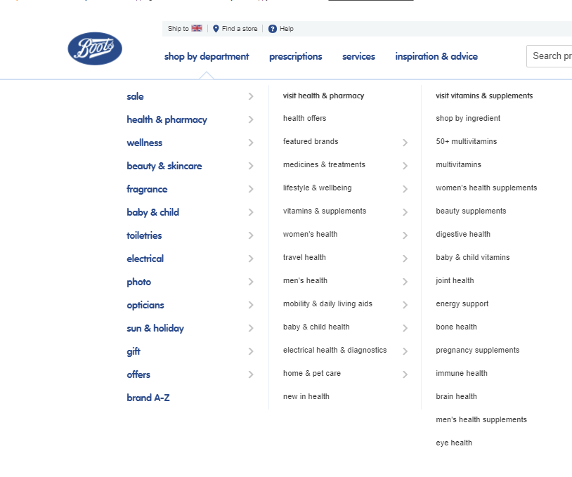
Website navigation best practices
Dropdown menus are bad for users and bad for SEO — but if you do resort to one, make sure it's in HTML and that it's designed based on user experience and usability, not just aesthetics.
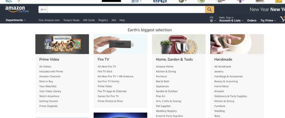
Amazon has a huge product catalog, but they have managed to create a more user-friendly (but still text-heavy navigation system):
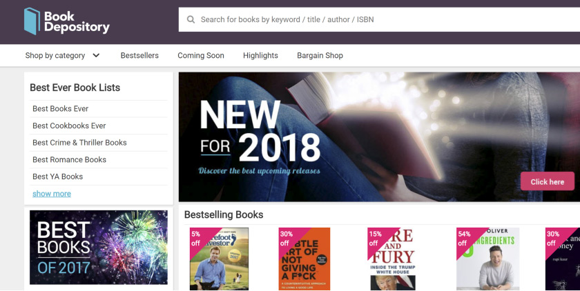
Focus on the universal navigation, but allow for multiple menus as well. This example from Book Depository is a good example of how curated lists can make for good secondary menus:
Think about your web design in the same way — you want the main navigation to work in conjunction with the header image, CTA, and user journey. It's like the skeleton holding everything together, so spend time testing and tweaking it.
Site structuring
Remember, the fewer page levels you have, the better, so where possible, consider condensing multiple pages into fewer pages, and don't be afraid to create standalone landing pages for social or promotional purposes.
It's best to map out your designs in an incremental way, starting from the homepage and landing page, cascading to category and blog pages. This means that logic will be very strongly built into your designs.
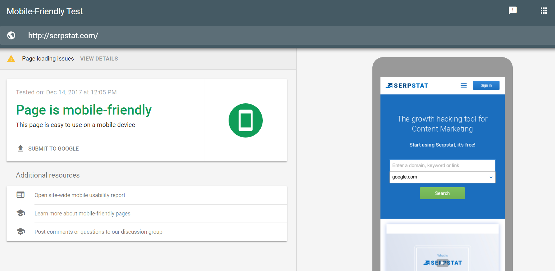
Mobile-friendly design is a must
There are three approaches to mobile web design: separate URLs, dynamic content, and responsive design. Google helpfully offers a number of tools you can use to test a website's mobile usability, Search Console being one of them. Speed is critical on mobile too – most users will leave a mobile website if it takes more than three seconds to load. Bear in mind that mobile data networks are not always as swift as Wi-Fi.
Google has stated on various occasions that responsive design is their preferred mobile configuration, which is worth bearing in mind if you're just starting out on a new design project. Some speculate that responsiveness is a ranking factor in itself.
Useful SEO tools for designers
- BROWSEO – a web app that allows you to view any web page without distractions caused by styles. Essentially, how a search engine sees your website
- GTmetrix – gives you insight on how well your site loads and provides actionable recommendations on how to optimize it
FAQ. Common questions about web design
What is the best professional web design software?
There are plenty of them, most popular are: WordPress.org, Sublime Text, Adobe XD,Webflow
How to learn web design?
To learn web design you should start from the basics of HTML and CSS, then explore Java Script. Besides, it will be very useful to understand principles of UI and UX.
What is tracking in web design?
Tracking is a term used to identify the way you decrease or increase the horizontal spacing between a range of letters or characters. Usually, this technique is a method designers leverage to adjust and fine-tune the letter spacing of a font on a website.
Speed up your search marketing growth with Serpstat!
Keyword and backlink opportunities, competitors' online strategy, daily rankings and SEO-related issues.
A pack of tools for reducing your time on SEO tasks.
Discover More SEO Tools
Backlink Cheсker
Backlinks checking for any site. Increase the power of your backlink profile
API for SEO
Search big data and get results using SEO API
Competitor Website Analytics
Complete analysis of competitors' websites for SEO and PPC
Keyword Rank Checker
Google Keyword Rankings Checker - gain valuable insights into your website's search engine rankings
Recommended posts
Cases, life hacks, researches, and useful articles
Don’t you have time to follow the news? No worries! Our editor will choose articles that will definitely help you with your work. Join our cozy community :)
By clicking the button, you agree to our privacy policy.