Start Exploring Keyword Ideas
Use Serpstat to find the best keywords for your website
Be Understood: Data Visualization For Marketers


and Consultant at ianlurie.com
You must have heard the expression — “a picture is worth a thousand words”. According to studies, almost 90% of people perceive information better visually than in text format. Therefore, it is a visualization that helps users evaluate the meaning of the information or data they are looking for. From this, it should be concluded that data visualization has become the key to advanced analytics.
Join our Google Calendar in order not to miss our online events!
What Is Data Visualization?
To better understand data visualization, we need to know that it is a form of information that helps users analyze data and decide based on it. But, in common, we can’t say that data visualization applies only to the Internet sphere. A simple example is the drawings of ancient people in caves that tell a story about hunting and their life.
High tech allows us to achieve the best visual solutions, but the goal remains to tell a story. Graphical visualization will enable you to visualize complex problems and separate important information from irrelevant ones. In digital marketing, the visual presentation of data shows the performance of a company or product based on key metrics. It's a tool to tell a story and help people to see, analyze and decide if they can achieve their goals.
Are you interested in getting the webinar recording?
Ian Lurie, a veteran marketer, shares tips on crafting clear, concise, and action—oriented marketing presentations using data visualizations.

Types of Data Visualization
You already understood that data visualization is a graphical representation of any information. But if you go deeper, it is worth considering in more detail the types of information visualization:
- Graphs and diagrams. Back in school, you studied graphs in Excel, but in the modern world, it's not just scatter plots, bars, and pie charts. There are over 60 well—known types of diagrams, but this number is growing daily. People are finding new types to visualize complex and nonstandard data.
- Infographics. They often use graphic design elements such as icons, images, charts, and graphs to simplify and communicate information more visually appealingly than a text-based article or report.
- Maps and cartograms. This ancient data visualization method displays the surrounding reality (cartograms use color). Data for creating maps can visualize everything from population density to the number of single people in your company).
- Interactive storytelling. If we consider the essence of this type, then it is closer to data journalism and infographics. But this is not just an infographic that has pop—ups added to it. It tells the story with which the listener interacts. These are cool technological solutions that you can see in major media or as individual projects. Read the book by Edward Tufte, who described the modern science of great data visualization.
- Presentation and data analysis. Academics and business analysts most often use visual data presentation. The presentation is created in such a way that the same data has different graphical representations. This is necessary to find hidden, at first glance, relationships and dependencies. Then a more sophisticated analysis tool can be used.
- Business analytics and dashboards. This is another way of displaying data where Excel or R is usually used for analysis. But if a business needs to track routine KPIs, then it is better to use dashboards. This is a general picture with the use of various graphs, diagrams, and tables, which allows you to get a more convenient report. Drawing up dashboards is a rather complicated and extraordinary task, but this is the most effective solution in some instances of business analysis.
Having studied the expanses of the Internet, we will move away from the virtual world a little and talk about another type of data visualization — scientific and medical imaging. Of course, this type is not used by the digital marketer, but it also needs to be considered. This representation of data is often three—dimensional and requires exceptional knowledge of specific software for construction. Usually, the purpose of such visualization is to look for anomalies or patterns in science or medicine.


5 Benefits of Data Visualization
Only you are involved in your massive data; you need to interpret it correctly because customers will have about 10 minutes to look at it. Visualization will help you reduce mental tasks that take up many columns and rows in tables.
Before determining how to create data visualization, you need to find out for what purpose you need it. Any visualization should serve a specific target and be aimed at obtaining a precise analysis. To understand what you require and whether this way of presenting information will be helpful for you, find out the benefits that can be received.
- The main channels of data perception are involved when the viewer looks at this. Often modern managers hold meetings on a flip chart because the information is visible to all participants and is easy to digest. Also, data is remembered better if it is discussed.
- Any information is perceived through the prism of personal understanding, and it is distorted when transmitted to others. Drawing up visualization is a precise process where all inaccuracies are visible to the eyes. This allows you to eliminate errors that are associated with, for example, wording or interpretation.
- If the visual representation of data is interesting, understandable, and discussed, it is remembered better. It is forgotten if the data is not in demand and is uninteresting. There are many visualization systems to convey information to the viewer, which we have discussed above. Choose the most suitable one and make the image “yummy”. Thus, you can transfer any, even the most complex data, by combining them into a simple scheme.
- Infographics are pictures that show information in a way that is easy to understand. They help you see how things are related and compare what is happening now to what should be happening. This makes it easier to see problems and understand information without reading much text.
- Data visualization allows you to find areas that require special attention or improvement. You will be able to find out which marketing factors influence the behavior of your viewers or customers, and understand or explain complex trends, make forecasts to increase conversions.
Having studied the features of the human brain, scientists have proven that it is easier for people to read charts based on the lengths of bars or lines for big data visualization. Visualization helps you experiment with different projects and scenarios by adjusting and changing them. This way of conveying information is more interesting and involves the audience. But one question arises — how to attract an audience?
How to Engage Your Audience Using Data Visualization
Displaying data allows you to convey information more clearly to viewers (clients). Visual elements create a clearer picture of the offer. But first of all, you need to find your audience and motivate them to see your story.
Provide Instant Clarity
Set Instant Context
The context should be straightforward. Add a title, graph, table, chart, and so on. You may need to add more visual effects and not just be limited to appropriate backgrounds and colors. Important points can be highlighted with annotations. The context helps the viewer better understand the information's essence, so it must be perfectly thought out.
Use colors to make better contrasts and choose natural colorings. Some primary tints can give viewers headaches. Keep in mind that not all people see all colors as they are. You need to think also about color-blind people.
Enable Drill-Down
Visualization drill-downs are needed to create hierarchies where users can click on a chart element and explore the data in a specific part of the object. Authors can customize these hierarchies and add some dimensions in the right place. Such hierarchies are powerful; users look at data instantly and get valuable information faster.
Get Rid of the Clutter
You have already chosen the type of data visualization you need, but does it involve the audience in the secrets of your information? Is your data in the right place? Does the design evoke curiosity and intrigue? The value of your visualization is enhanced by simplicity and clarity and not by a bland and chaotic set of graphs, charts, maps, and diagrams.
Visualization is a structuring of the data you have collected, studied, researched, and searched for the main aspects. Your aim is to present this information to the audience in a clear and concise manner, so that they don't have to spend time understanding the processes that you have already gone through.
Best Services and Tools for Data Visualization
Many data visualization services and tools can help you visualize any kind of data. These instruments have many functions with templates, and you can customize them to suit your needs. Such software helps many marketers because it saves time they spend collecting, analyzing, and building visualizations. Such services and tools are convenient and important, especially for those who are not statisticians or math person but need to visualize a huge amount of data.
Google Looker Studio
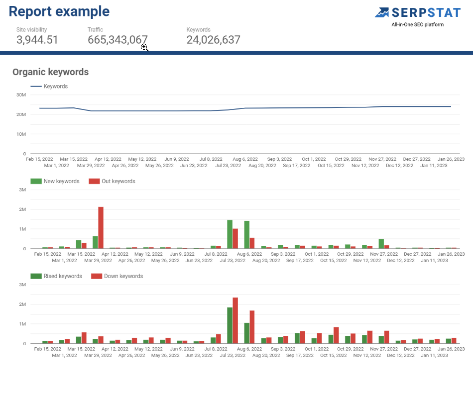
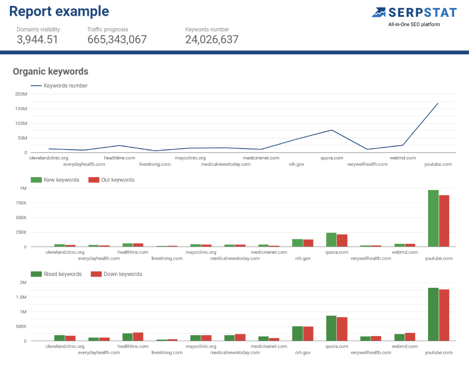
You can analyze and structure data in various partner sources: Cloud SQL, Facebook Ads, Search Console, Serpstat, and others. Such software has many templates in which you correct data for visualization without programming skills.
Serpstat’s connector for Google Looker Studio is a simple way to get a visualized dashboard of SEO metrics. There are two methods available:
Ready to try Serpstat for Data Visualization?
Start your 7-day trial of Serpstat today and experience the benefits of visualizing your data! At the end of the test, you'll be allowed to continue using our cutting-edge tools or discontinue without charging.
Join NowChartBlocks
This is one of the many data visualization tools utilized by marketing professionals and designers. With this tool, they can create visually engaging content featuring lines, scatters, columns, and pie charts. The creation process is user-friendly and doesn't require coding skills.
Flourish
Flourish is a data visualization tool that allows users to create diagrams, maps, and interactive stories. A user-friendly interface makes it suitable for beginners to understand and utilize its functions quickly. A library of templates is also available to assist with visualizing various types of data.
Tableau
Tableau is a data visualization software that enables users to connect to multiple data sources, perform data analysis and create interactive visualizations in the form of dashboards and reports. It has a user-friendly interface allowing easy data exploration through a drag-and-drop system. The software includes advanced features such as calculated fields, reference lines, and forecasting for more in-depth analysis. Tableau can be used for various purposes, including extensive data set breakdown, communicating insights, and presenting data-driven stories to the public.
Conclusion
Data visualization is crucial for marketers in today's data-driven world. Using such tools, marketers can effectively communicate complex data sets, insights, and stories in a visually appealing and easy-to-understand manner. This enables marketers to reach their target audience, effectively communicate their message and drive business results. Whether through interactive dashboards, dynamic reports, or data-driven presentations, data visualization provides marketers with a powerful tool to understand and make data-driven decisions.
Speed up your search marketing growth with Serpstat!
Keyword and backlink opportunities, competitors' online strategy, daily rankings and SEO-related issues.
A pack of tools for reducing your time on SEO tasks.
Discover More SEO Tools
Serp Crawling
Scrape Google SERP and analyze
Connector With Looker Studio
Connect to Looker Studio and create reports with data visualization
Bulk Keyword Analysis
Revolutionize your keyword research process with our bulk keyword checker
Keyword Difficulty Tool
Stay ahead of the competition and dominate your niche with our keywords difficulty tool
Recommended posts
Cases, life hacks, researches, and useful articles
Don’t you have time to follow the news? No worries! Our editor will choose articles that will definitely help you with your work. Join our cozy community :)
By clicking the button, you agree to our privacy policy.