Start Exploring Keyword Ideas
Use Serpstat to find the best keywords for your website
How To Create A Perfect Newsletter And Get 60% Open Rate: Asking Experts

In this post, experts will tell you about ways to encourage non-active users, fight spam, and share useful hacks.
Format: what newsletter types exist and what they serve for
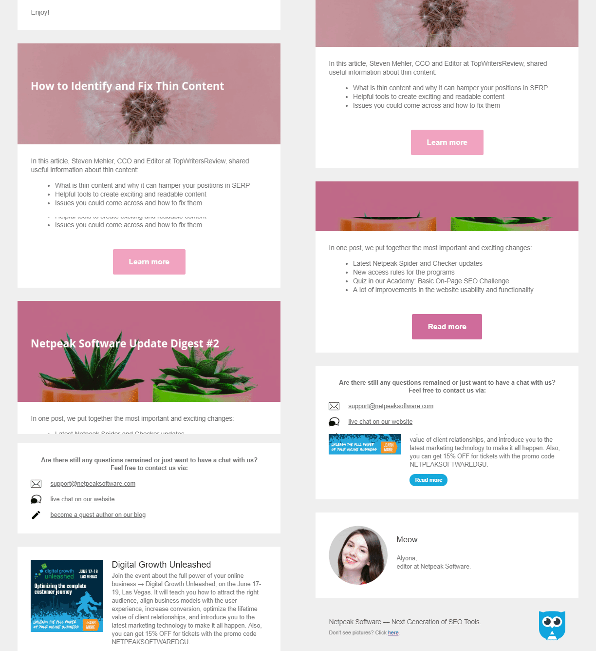
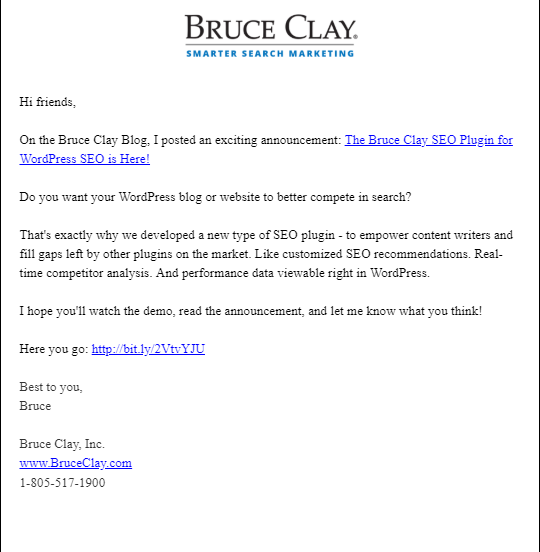
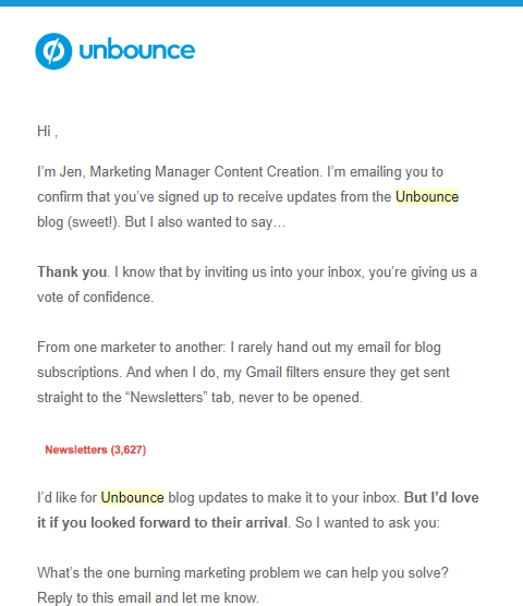
Design: how should the newsletter look like
Subject line
The subject should be understandable and inform the reader about the content. Also avoid traditional spam words like "cheap", "free", "last chance" etc. Also, you should alternate the subject lines so they won't bore your readers. "The best blog articles of September" is dull and only worsen the open rate. It is essential to motivate the subscriber to open your letter. This motivation can be achieved in different ways: through scarcity/by curiosity/through personalization and emojis.
Our survey has shown that the majority of editors like to use emojis in the subject line or in the body of the newsletter.
Greeting
- formal greeting (Dear Sir/Dear Mrs)
- first name and last name
- only last name
- with an impersonal welcome (hello!)
Most newsletter editors use personalized greetings when their subscribers are segmented. Nevertheless, be careful! If you're not sure that the recipient names are displayed correctly in your newsletter tool, avoid using names in the e-mail.
Content
Footer
Interactive elements
- videos
- GIF animations
- image carousels
- quizzes
- contests, etc.
Nevertheless, be careful because these elements can extend the loading time or can be displayed incorrectly. Therefore, check if GIFs and other creative elements look good statically and are informative.
Mobile optimized newsletters
Spam: how do you avoid it?
Perfect newsletter: experts' opinion
1. What services to use to send newsletters
2. How often they send them
3. How to personalize e-mails
4. How to encourage inactive users
5. How to fight spam
6. How to track analytics
They also shared some useful advice, so keep reading!
What service do you use to send newsletters?
How often do you send your newsletters?
What types of newsletters do you use?
This sometimes includes direct links to additional resources - particularly if we've published an article with a content upgrade, or some form of subscriber-only content. We'll occasionally include deals, or other recommendations.
Do you personalize your emails? How?
As events, webinars, content arises that aligns with those interests, we segment groups accordingly. Not super deep personalization, but great to keep inboxes from overflowing.
How do you track analytics?
How do you encourage users who are not active?
I do my best to make sure that every email I send provides huge value to people. When people ignore your emails, they're reducing your conversion rates. The size of the list doesn't matter, what matters is how many people engage with your content and use it. A smaller more engaged list has more value than a large number. So, we do a re-engagement campaign to anyone who hasn't been active over the past 3 months. I ask them to take some action to indicate they still want my content. If they don't respond, we automatically unsubscribe them.
What are your average open rate and click rate?
How do you fight spam? How to avoid being added to spam?
The other thing that I do is regularly clean my lists.
Share some useful lifehacks or give your advice
In short - we are using scarcity and exclusiveness as our strategy to draw highly qualified leads, letting them know that it's you choosing who can "join the tribe", even when it comes to free newsletters.
This strategy could be smartly used along with the regular email newsletter sign-ups. Skillful copywriting that speaks to the needs of your new audience can substitute the lead magnet incentive (if done well).
Have a QA team - someone who checks links, someone with a creative eye to check images, someone who digs in on the copy. Splitting up jobs allows you to keep the workflow of the people you're asking for help low while making sure your audience receives a solid product. You as the builder of the email are going to miss A LOT if you just QA yourself. You're too close to it.
If people are interested in what you have to say they will always open your content, regardless of how infrequently you send a message. The second tip I have, which I mentioned earlier, is to set expectations. People want to know what they are signing up for. You can easily cover this through a welcome email campaign.
Summary: checklist of a successful newsletter
Speed up your search marketing growth with Serpstat!
Keyword and backlink opportunities, competitors' online strategy, daily rankings and SEO-related issues.
A pack of tools for reducing your time on SEO tasks.
Discover More SEO Tools
Domain Analysis Tools
SEO Domain Analysis – gain insights into your website's strengths and weaknesses
URL Inspection Tool
Uncover hidden SEO opportunities with our powerful URL Inspection Tool
Keyword Rank Checker
Google Keyword Rankings Checker – gain valuable insights into your website's search engine rankings
Competitor Website Analytics
Complete analysis of competitors' websites for SEO and PPC
Recommended posts
Cases, life hacks, researches, and useful articles
Don’t you have time to follow the news? No worries! Our editor will choose articles that will definitely help you with your work. Join our cozy community :)
By clicking the button, you agree to our privacy policy.
