Which fonts, buttons and colors to use in the mobile version of a website
What is a mobile typography
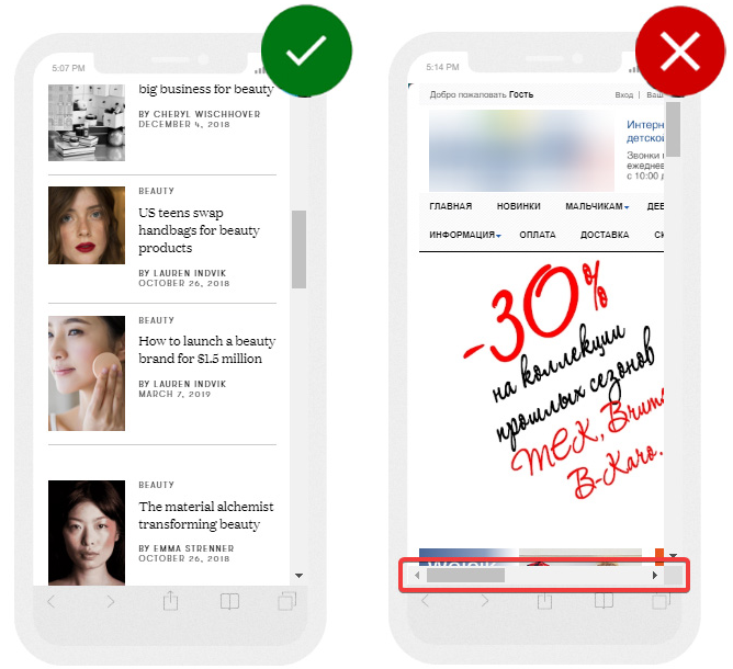
In the example below, the mobile version of the website is displayed on the left with easy to read fonts, and all information is placed within the screen width.
The text on the right side is too small; an unsuccessful font for promo offer is used. There is a horizontal scrollbar since the website is not adapted for mobile devices:
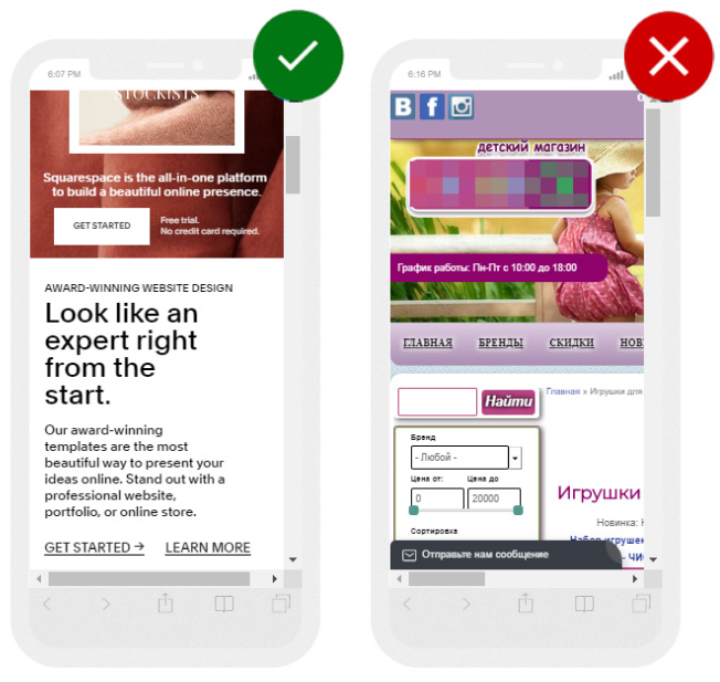
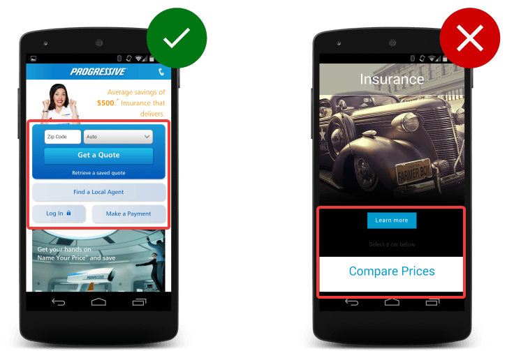
In the example on the left, all conversion buttons are located in a visible place; they are quite large. The website on the right uses too small fonts and non-responsive design:
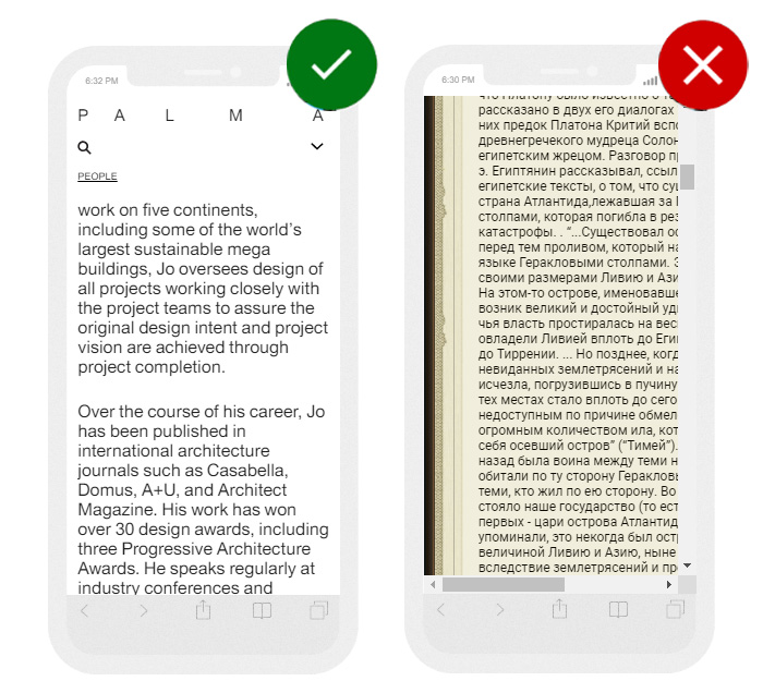
The example on the left uses a readable font for the main text, the length of the line, and the division into paragraphs facilitate easy perception of the material. The text on the right is not divided into paragraphs; the font is too small. It's very difficult to read such content using a mobile device:
Font size

- for user input and body text: at least 16 px;
- for less important text: 14 px;
- line spacing: 24 px.
Also, depending on the topic of the website, it is worthwhile to understand the conditions under which people read published articles, for example, in public transport or while heading to work on foot. You can see this in the analytics (viewing time). If the main traffic comes in the mornings and evenings, it's clear that people visit the website on their way to work and back.
Find more detailed instructions from the information posted on Material Design.
Empty space
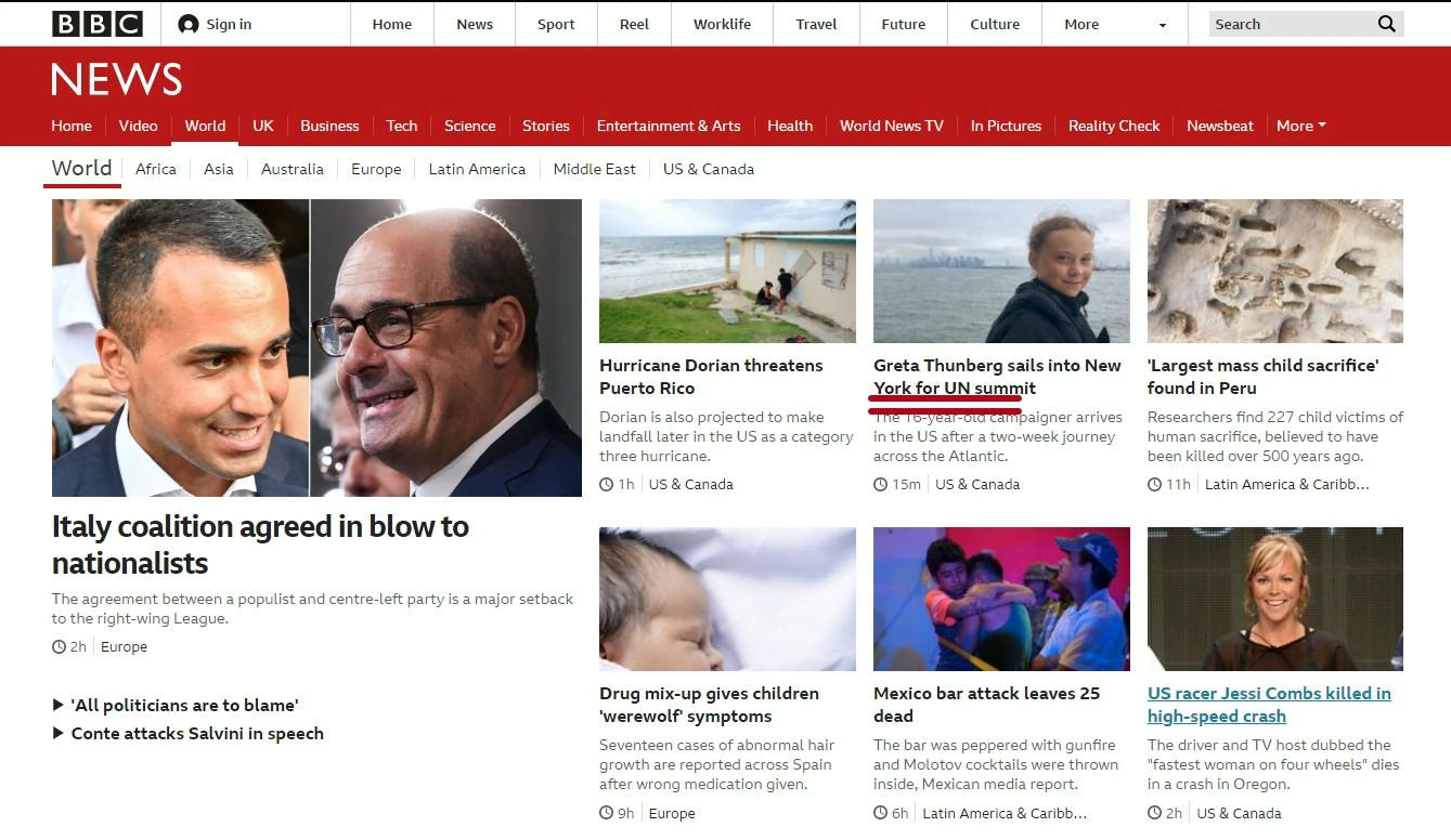
Lack of decorative elements
Line length

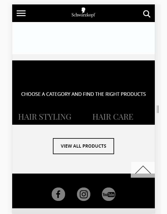
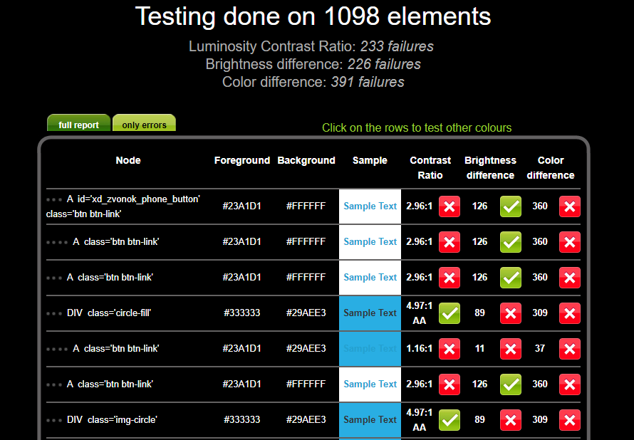
Color combinations
Headings

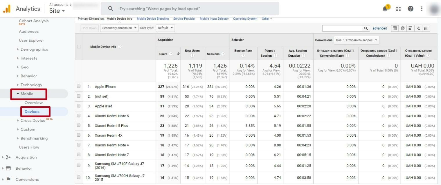
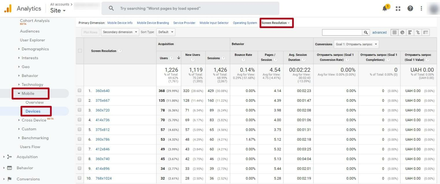
How to see what devices are used to visiting your website
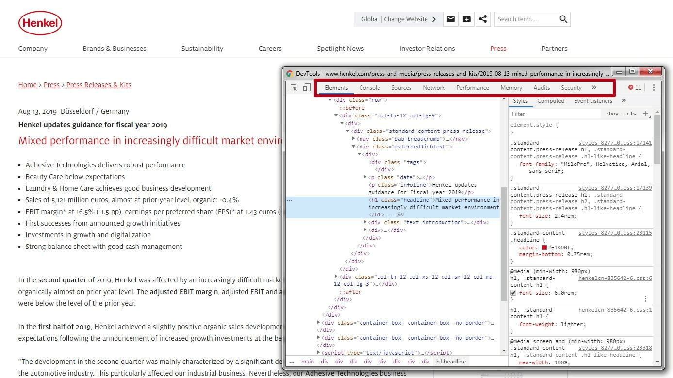
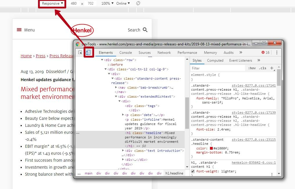
How to set the font size for mobile devices in CSS
The font size for mobile devices should make it easy to use the touch screen without causing inconvenience when clicking the links in the text. It is also necessary to choose a suitable line spacing to ensure the readability of the text.
You can place media queries in the following ways:
- inside the HTML page using the <style> tag. In this example, a font of 16 pixels is set for mobile devices with a screen width of up to 500px:
<style>
@media (max-width: 500px) {
body { font-size: 16px; }
}
</style>- in an external CSS stylesheet this option is preferable:
@media (max-width: 500px) {
body { font-size: 16px; }
}@media (max-width: 600px) {
body {
line-height: 2;
}An appropriate size of the buttons for mobile version websites

Using different sizes, you can indicate the degree of priority of the button. For example, use buttons with a maximum priority of 72px and a minimum priority of 42 px. You should also set the appropriate distance between the buttons, which is calculated based on their size:
- 12-24px (10-13mm) for large buttons;
- 24-36px (6-10mm) for medium-size buttons;
- 36-48px (3-6mm) for small buttons.
For text buttons, similar height standards (42-72px) are used, only the width will be different. The space between these buttons for optimal visual separation should be at least 12px.
Besides, you should place the conversion buttons in the middle of the screen so that they are visible:
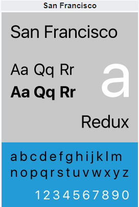
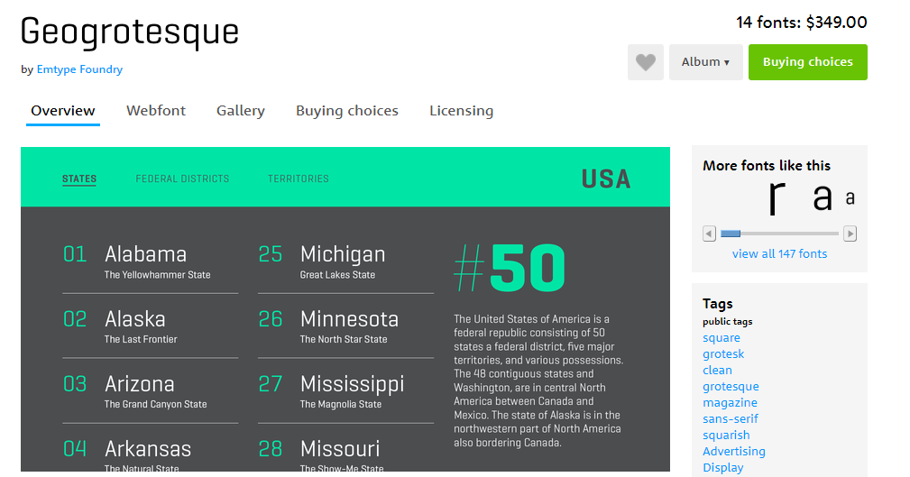
What fonts to use for the mobile version
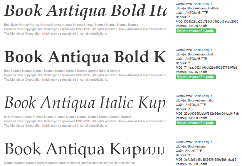
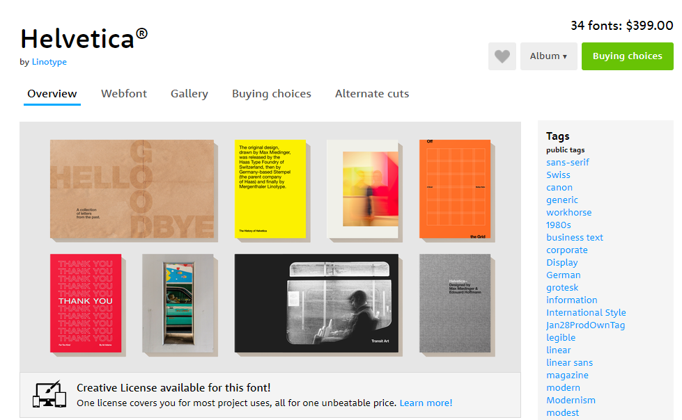
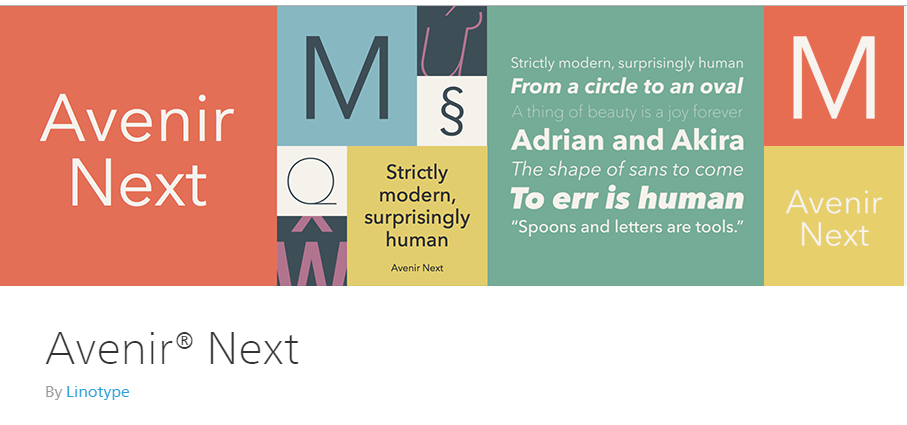
Conclusion

| Watch the video course |
Speed up your search marketing growth with Serpstat!
Keyword and backlink opportunities, competitors' online strategy, daily rankings and SEO-related issues.
A pack of tools for reducing your time on SEO tasks.
Discover More SEO Tools
Tools for Keywords
Keywords Research Tools – uncover untapped potential in your niche
Serpstat Features
SERP SEO Tool – the ultimate solution for website optimization
Keyword Difficulty Tool
Stay ahead of the competition and dominate your niche with our keywords difficulty tool
Check Page for SEO
On-page SEO checker – identify technical issues, optimize and drive more traffic to your website
Recommended posts
Cases, life hacks, researches, and useful articles
Don’t you have time to follow the news? No worries! Our editor will choose articles that will definitely help you with your work. Join our cozy community :)
By clicking the button, you agree to our privacy policy.
