What is call-to-action and how to use CTA on the landing pages
What types clients are divided into?
If we consider users through the prism of consumer behavior, then there are three types of customers:
- cold — they are indifferent to the offer or do not know anything about the product;
- warm — they express a certain interest in the offer, but in most cases, they are focused on buying in the future. Such clients may know several solutions to the problem and at the moment determine which one is better / more profitable / safer;
- hot — they're ready to buy, basically, they clearly know what they need, and with a competent direction, they immediately make a purchase.
To do this, create several identical landing pages and use different calls to action on each of them. To get the result, the same amount of advertising traffic is sent to each of the landing pages, and the conversion rate is fixed.
The second is to take advantage of the experience of other companies. Let's consider this option in more detail.
How to create an effective call-to-action
Use action verbs
Who is it for?
It's for those who work with a hot audience. If the visitor clearly understands his needs and chooses who will best satisfy it, tell me briefly and clearly what to do. For example: "Subscribe and receive exclusive tips about fashion and beauty", "Order a smartphone right now and get a cover as a gift." Such calls can be displayed on the pages of goods and services, as in most cases, users who are interested in the company's offers get there.
Who is it not suitable for?
Those who work with a cold audience or unfamiliar product. On the pages of the commercial site blog, there may be a user who is not planning a purchase but only interested in the subject of the site. In this case, he will be scared away by a too persistent call to action.

Press on emotions
Greed: "Only today," "Limited time," "7 days of the trial period for free," and others.

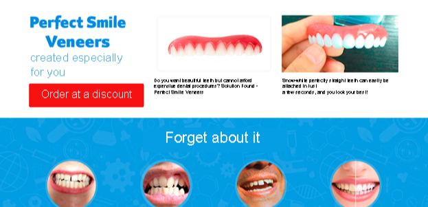
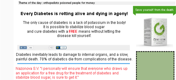
Envy: "At the neighbor is already equipped with a satellite dish. And you?", "Become a partner to earn hundreds of dollars a month in the service! I know from personal experience that this really works", and others.
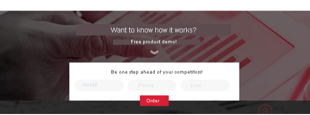
Shame: "Are you sure?", "Tortured by hemorrhoids?" and others.
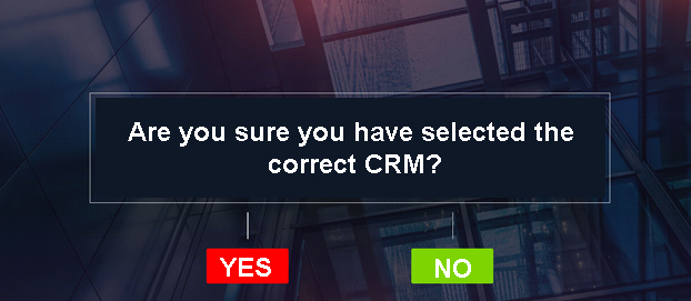
A warm and cold audience. The main thing is to carefully study the psychological portrait of the consumer and be careful with shame. Too much pressure will cause a feeling of guilt, and you will say goodbye to a potential client forever.
Who is it not suitable for?
For those who have no idea who his client is. Attempts to "shoot at sparrows" will lead to excessive spending of the advertising budget and the lack of results. It is also not advisable to use this tactic for hot buyers who are already ready to make a purchase.
Encourage them to take action, arguing that they are appropriate
- Tell the visitor why he needs to perform this action;
- try to clearly and concisely explain the reason why a person should "buy", "order", "leave a request", "subscribe to news", "call today", etc.;
- why does the client carry out the action? If the answer is simple (to lose 10 kilograms, get rid of freckles, cure sinusitis, etc.), you are on the path to success.
Your task is to understand why your client needs the product and display this reason on the landing page: "Call today to get a free consultation", "Leave a request now and get into the group with a native speaker".
Sounds more convincing, doesn't it?

Ideal for a warm and hot audience, as it responds to a conscious need and provides an understanding of the benefits.
Who is it not suitable for?
For a cold audience that does not have a formulated need related to the proposal yet.
Where and how to place a call to action
Do I need to place a call to action at the top of the page
Call for action placements can only be dictated by the complexity of the landing page. On short pages, it is better to add a call at the top, on long pages — below the first screen.
What is the reason for this?
It's all about motivation. On longer pages, information is always presented more simply and in detail. A person reads, gets carried away, and is sure to scroll down to get to the call to action. Just do not delay, as the call to action, placed below the third screen, reduces the conversion rate.
This is because there are mobile Internet users. Despite the fact that they are configured to scroll longer pages, do not make them twist for too long.
A difference in the placement of the CTA on the right and left sides
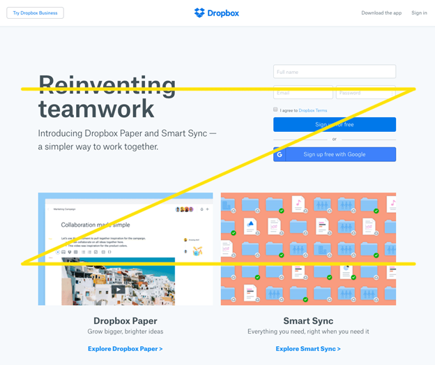
You can adjust only by taking into account the algorithm of the process of studying a page by a person.
After loading the page, the user looks at the left side of the screen, moves his gaze to the right, and concentrates on this area. Then quickly skips the lower left side and moves to the right, to subsequently exit the page. Visually, it looks like this:
Conclusion
- Always consider the landing page as a whole in terms of the AIDA consumer behavior model (attention, interest, desire, action).
- Create a story for your visitors that begins at the top of the page and consistently leads to the decision you need.
- Use calls to action appropriate to the type of consumer.
- Place the call to action harmoniously, paying attention to the design of other page elements. He must stand out.
- Test and optimize.
Creating an effective call to action is a difficult task. This path consists of trial and error, the result of which is an increase in the conversion rate of the landing page and your profit.
It's worth the work, isn't it?
This article is a part of Serpstat's Checklist tool
 " title = "How to use calls-to-action on the landing pages 16261788379043" />
 | Try Checklist now |
Speed up your search marketing growth with Serpstat!
Keyword and backlink opportunities, competitors' online strategy, daily rankings and SEO-related issues.
A pack of tools for reducing your time on SEO tasks.
Discover More SEO Tools
Tools for Keywords
Keywords Research Tools – uncover untapped potential in your niche
Serpstat Features
SERP SEO Tool – the ultimate solution for website optimization
Keyword Difficulty Tool
Stay ahead of the competition and dominate your niche with our keywords difficulty tool
Check Page for SEO
On-page SEO checker – identify technical issues, optimize and drive more traffic to your website
Recommended posts
Cases, life hacks, researches, and useful articles
Don’t you have time to follow the news? No worries! Our editor will choose articles that will definitely help you with your work. Join our cozy community :)
By clicking the button, you agree to our privacy policy.
