Start Exploring Keyword Ideas
Use Serpstat to find the best keywords for your website
How to choose fonts and colors for a website
How to choose fonts depending on the website subject
Traditional sans-serif fonts, for example, Verdana or Aria, are suitable for a corporate website as they are associated with a strict business style:



How to choose a font
- use no more than four fonts on one page;
- use sans-serif fonts for main text as serifs make reading difficult on the screen;
- use serif fonts in the printed texts since readers associate them with reliability and respectability;
- use the Monospace family fonts for program code examples, instructions, or typewritten text;
- using custom fonts, such as Script and Fantasy, to design headlines and accents to attract attention;
- for headings and calls to action use larger font sizes than plain text.
Examples of fonts in graphic design
Fonts on your website are a part of your brand; think about your brand first, define its properties and qualities.

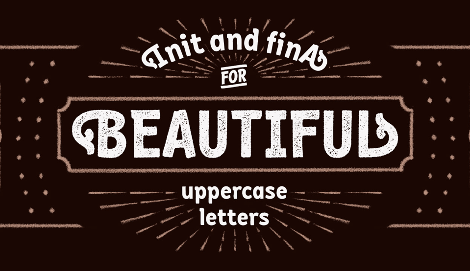


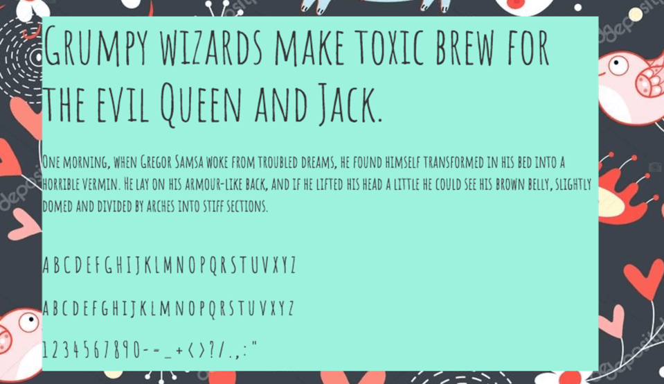
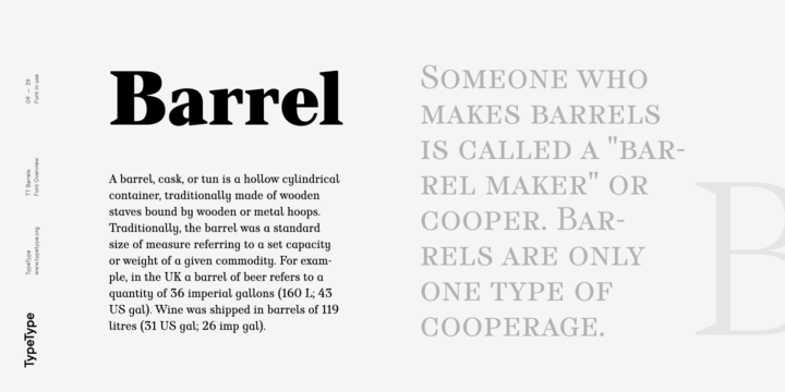
Serif fonts are great if you want to show commitment to tradition and company stability. These fonts animate the brand with a combination of vibrant graphics or colors:
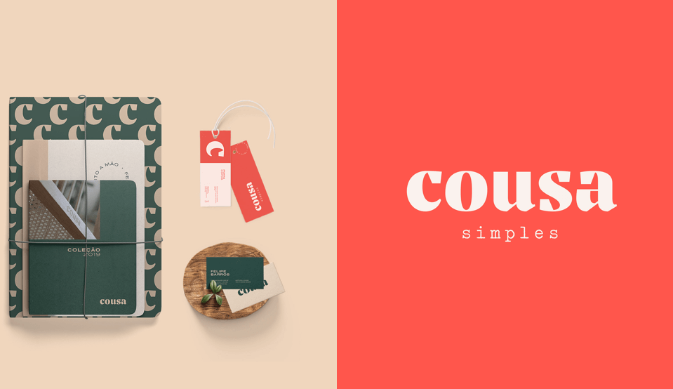
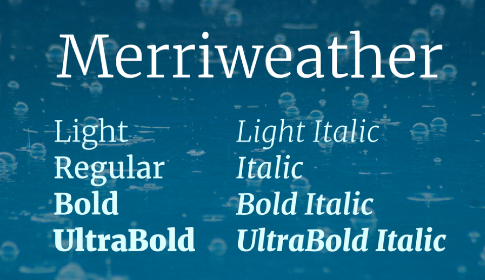
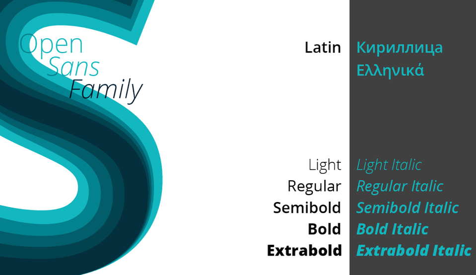
Openness, transparency, flexibility — all these things can be reflected via an expressive sans-serif font. A font with bold and combined with emotional live photos gives a sense of brand openness:


Where to look for professional fonts
How typography can help emphasize important information
- change the typeface — highlighting in bold or italics;
- coloring individual information blocks or conversion elements:
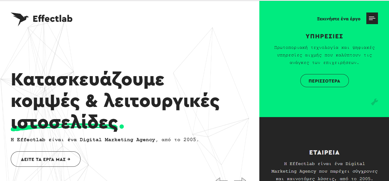
- change the color or size of a font.
How to use spaces in the text
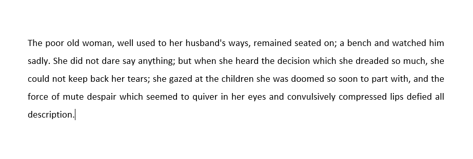


Use only one text column on a mobile version.
How to choose colors for a website
Online services for selecting the color scheme of a website
You can use the following online services to select a color scheme:
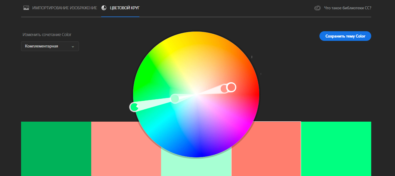
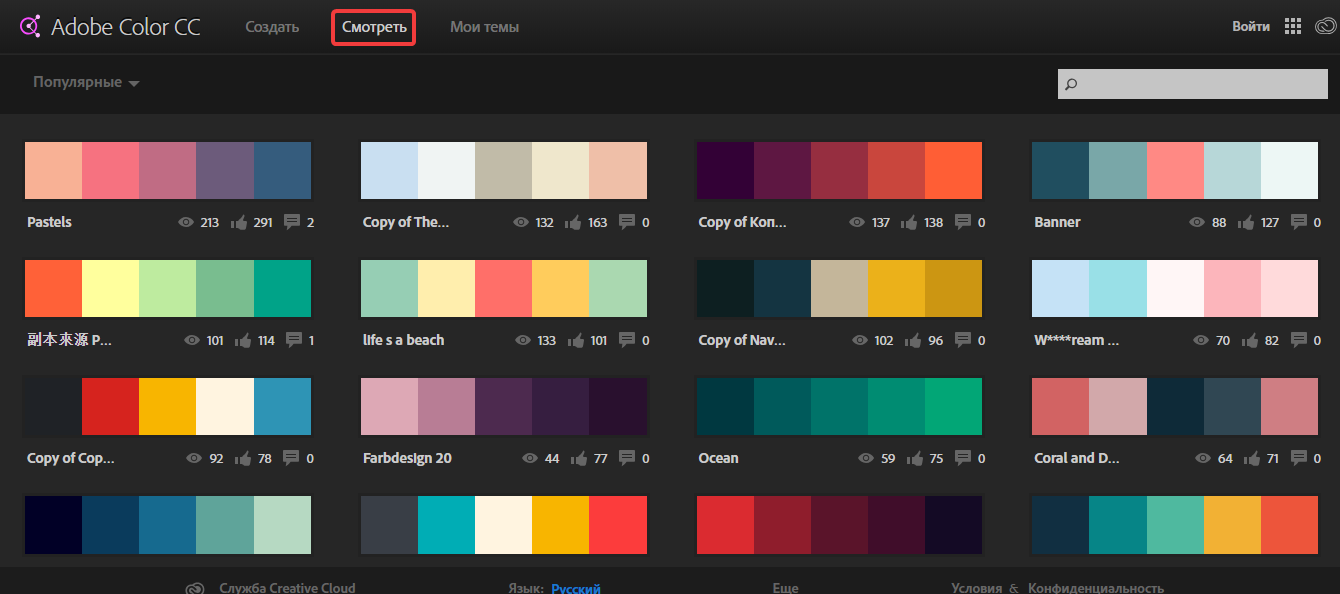
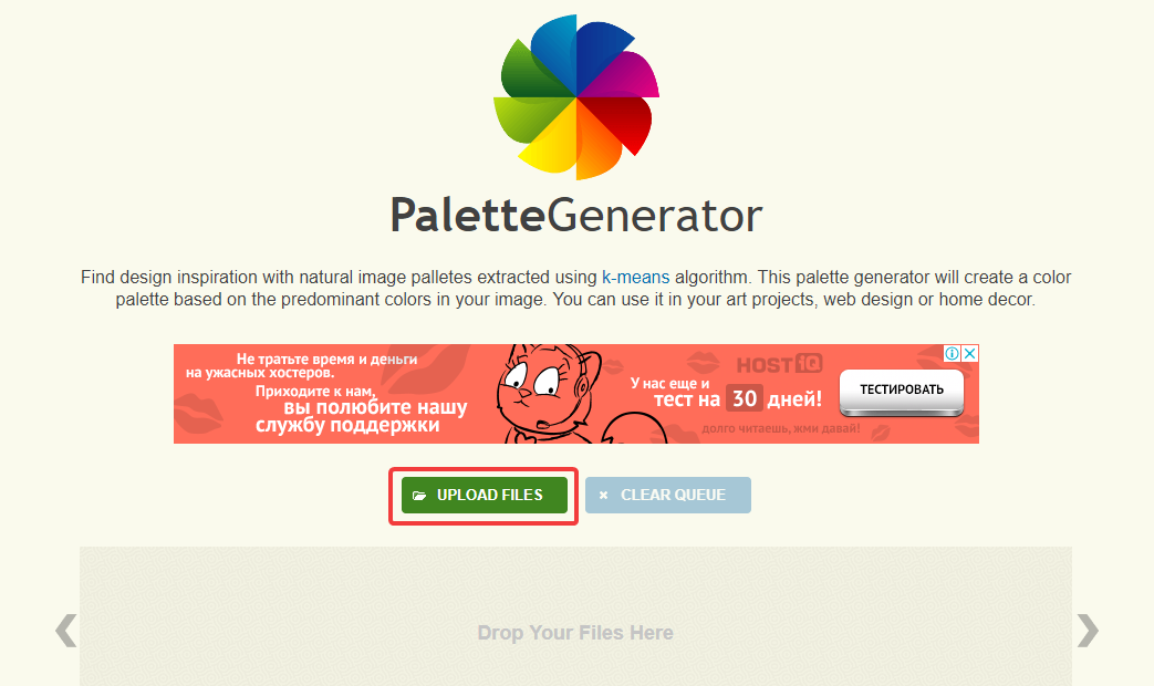
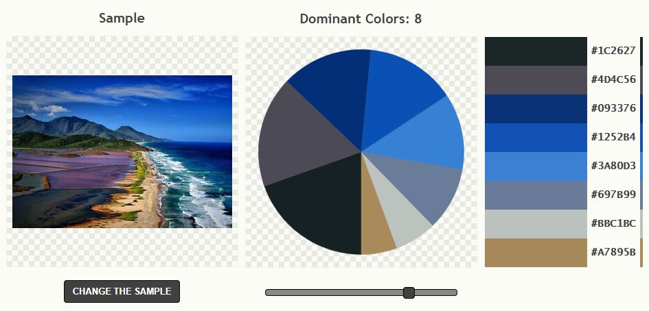
Psychology of the website color perception
According to this theory, each color has its own sphere of application, causing certain feelings and associations. It is important to remember that these statements are only true for European and American cultures, and in other countries, there may be a completely different attitude to these colors.
Let's consider the basic shades and their signs from the point of view of psychology, which help determine which colors to choose for the site:
- the red color is used to attract attention. Traditionally, this color is associated with energy, activity, passion, and danger. On websites, this color is often used to focus on transaction and call-to-action buttons.:
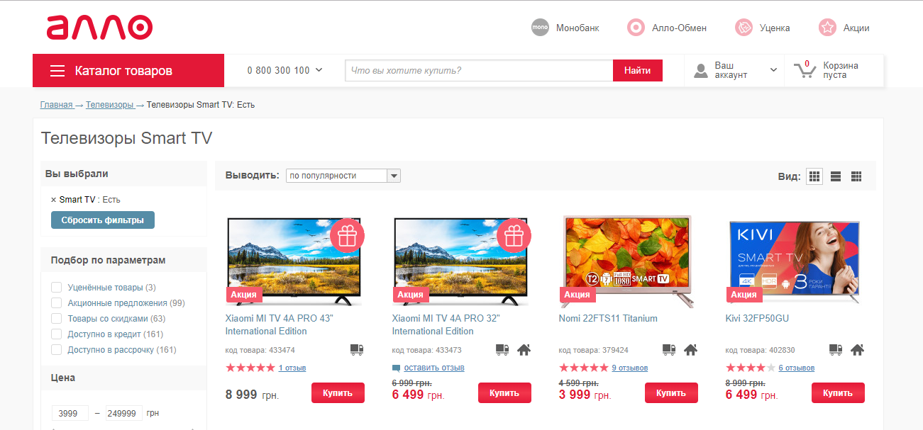
- orange is also often used for calls to action, as it is associated with enthusiasm, adventure, and creativity:
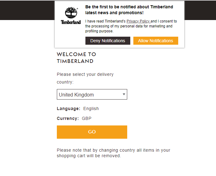
- yellow provokes ambivalent associations. On the one hand, it is sunlight, warmth, happiness, and optimism, and on the other, yellow is associated with deception and warning in people's minds. Small yellow color accents, harmoniously combined with the rest of the design, will create a positive impression of the site:
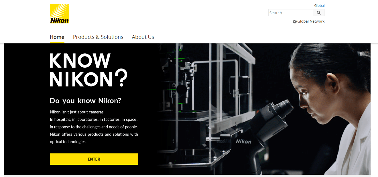
- the green color is associated with nature, a healthy lifestyle, and finances. This color will be most appropriate for websites related to pharmaceuticals, agricultural products, ecology, fitness or landscape design:
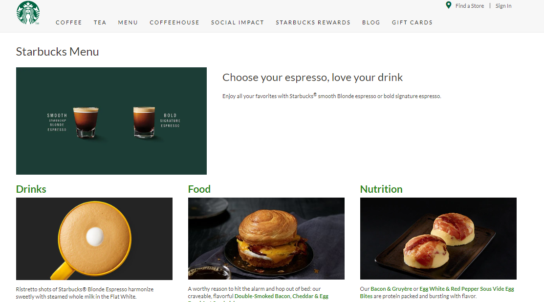
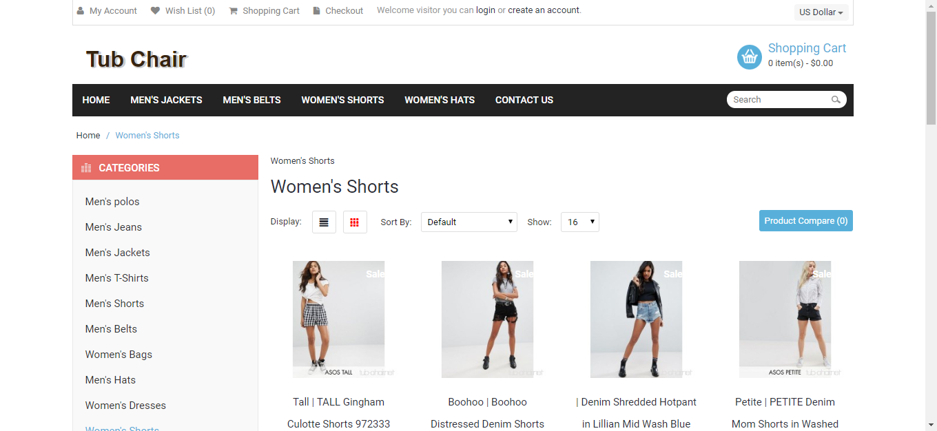
- light blue color causes a sense of harmony, serenity, and tranquility. The use of this color on the website forms a trusting relationship with the brand. Here's an example of the use of blue color for the conversion elements in an online store:
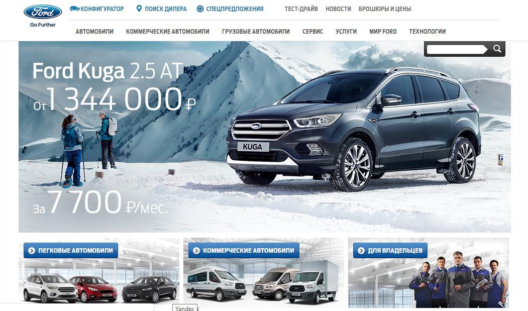
- the blue color is considered noble and status as it emphasizes strength and freedom. Below is the use case for color highlighting the most important menu items with blue:
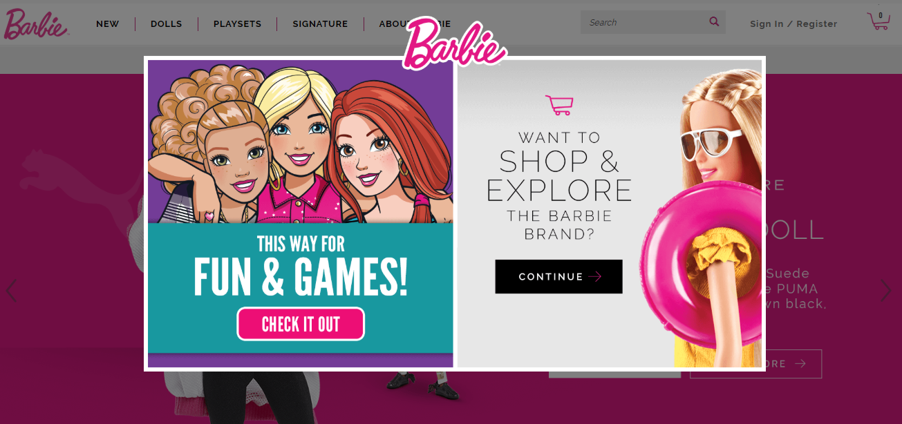
- purple is associated with luxury, wisdom, the beauty industry, and premium goods. In this example, the menu and conversion buttons are highlighted in purple:

- pink means femininity, playfulness, and unconditional love in color psychology. It is preferred to use purple on websites with the female audience:
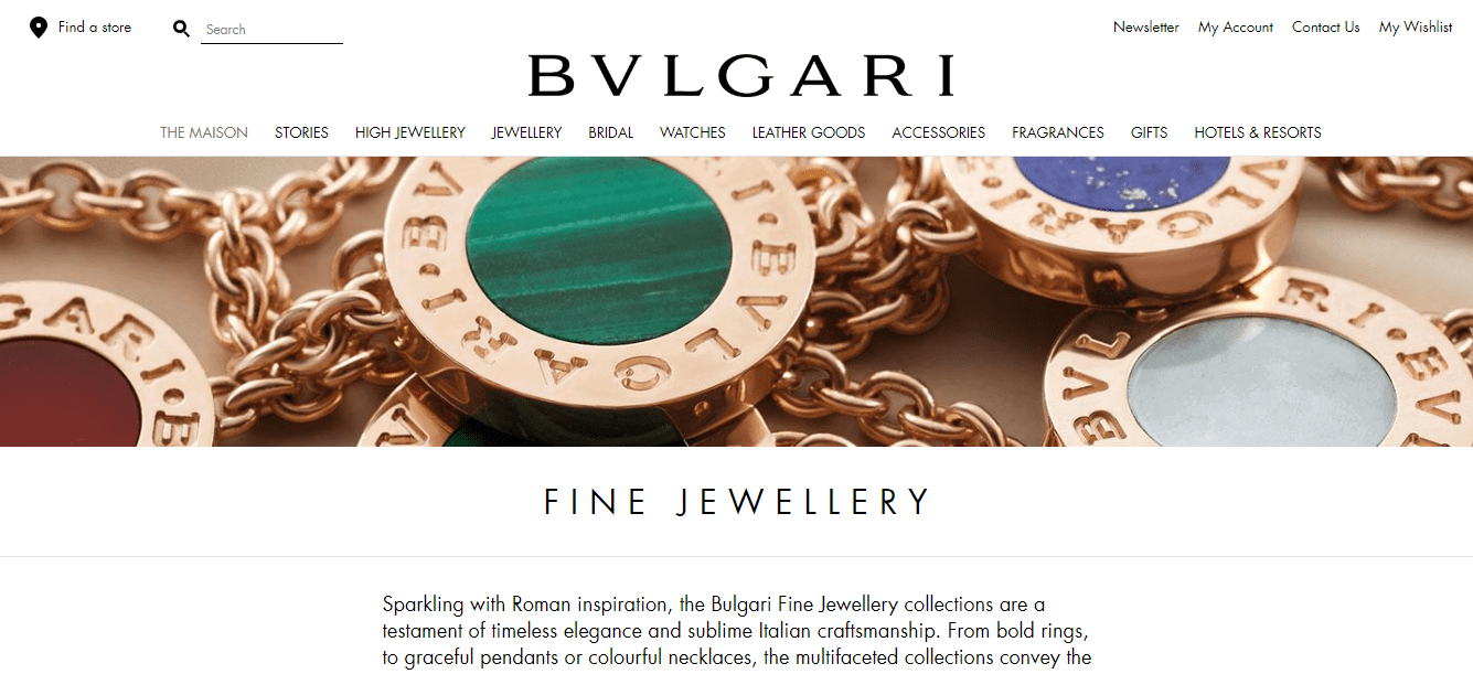
- in Western culture, white color is associated with purity and innocence, kindness and humility. This is the most popular color for commercial websites. The combination of white background and the black font is the best option for readability of the text:
- black is also popular in or commercial subjects. It evokes associations with power, mysticism, and elegance. For websites with a dark background, choose white graphic elements and a font:

Regulation on the use of colors and fonts on the website
This document will allow each page of the project to look like an organic component of the whole, without breaking out of a single picture and not making the user feel that they are redirected to another resource.
With a large number of employees with access to website administration, a clear regulation is the best option for ensuring coordinated actions when adding new text content to the project.
Conclusion
- choose fonts and their combinations that will look natural together and match the subject of the website;
- monitor readability and legibility of the text;
- set inter-character and line spacing for easy reading;
- emphasize content with a color that will evoke the right associations and visually match the corporate identity of the company.
This article is a part of Serpstat's Checklist tool
 " title = "How to choose fonts and colors for a website 16261788334785" />
 | Try Checklist now |
Speed up your search marketing growth with Serpstat!
Keyword and backlink opportunities, competitors' online strategy, daily rankings and SEO-related issues.
A pack of tools for reducing your time on SEO tasks.
Discover More SEO Tools
Tools for Keywords
Keywords Research Tools – uncover untapped potential in your niche
Serpstat Features
SERP SEO Tool – the ultimate solution for website optimization
Keyword Difficulty Tool
Stay ahead of the competition and dominate your niche with our keywords difficulty tool
Check Page for SEO
On-page SEO checker – identify technical issues, optimize and drive more traffic to your website
Recommended posts
Cases, life hacks, researches, and useful articles
Don’t you have time to follow the news? No worries! Our editor will choose articles that will definitely help you with your work. Join our cozy community :)
By clicking the button, you agree to our privacy policy.
