Start Exploring Keyword Ideas
Use Serpstat to find the best keywords for your website
What is a Viewport meta tag and how to use it
The meaning of Viewport tag
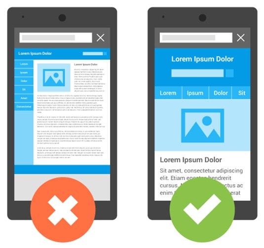
However, the same page will appear inconvenient on the screen of a mobile phone. To read the text, you will have to shift the displayed rendering left to right, up and down. To make the page look appropriately, you need to imply the Viewport tag:

Adaptive design makes reading easy. Additionally, it provides comfortable online shopping and navigation between website sections. To make you website look appropriate on devices with different screen resolution, it is essential to set up Viewport tag parameters correctly.
Setting up a Viewport tag on different devices

<meta name="viewport" content="width=800, initial-scale=1">Let us compare two smartphones both with 3,5 inch diagonal but different pixel density: 200 and 300. The same page will appear different on the two smartphones despite their identical display measures. The first device will provide a proper look of the page and comfortable reading as if it was a common computer monitor.
The second device will fail to display the site correctly due to its high resolution, so the text will appear too small. To normalize the display, it should be double scaled. Viewport meta tag is applicable to both adaptive and non-adaptive site versions.
Another important parameter is initial-scale which stands for the scaling coefficient. If the set value is "1", CSS will be fitted onto the display of the device despite its resolution. The value can be varied from 0,1 to 10.
How to identify the resolution of a device
The upper model Galaxy S5 has a density of 441 pixels and 1080x1920 resolution. Provided that the density is more than 300, we need to divide 441 by 150 which makes three if rounded. The resulting resolution is 360x640.
Where to write in the Viewport tag
- height — arranges the height of the visible area. Type in a required value from 200 to 10000 pixels or use of the constant device-height value that allows to automatically scale the layout in order to fit into the screen display.
- user-scalable — allows or permits user page scaling; identifies by Yes or No.
- minimum-scale — minimum scale value (from 0,1 to 10);
- maximum-scale — maximum scale value (from 0,1 to 10).
<!DOCTYPE html>
<html lang="en">
  <head>
    <meta charset="utf-8">
    <title>title</title>
    <link rel="stylesheet" href="style.css">
    <script src="script.js"></script>
  </head>
  <body>
    <!-- page content -->
  </body>
</html>Some mobile browsers do not support the use of Viewport tag. Opera Mobile Mini, Symbian, Openwave, and some other old browser versions do not react to Viewport tag commands. In this case, site optimization for mobile devices may be carried out by meta tags:

Conclusion
The optimal way is to set the automatic scaling that fits the page onto the device screen. Also, you can manually set the page height, scale coefficient, allow or prohibit zooming the display.
Meta tag activation requires adding a string with correctly-arranged parameters to Head section of every page, or you can set a plugin which conforms your CMS.
 " title = "What is a Viewport meta tag and how to use it 16261788340770" />
 | Run Site Audit |
Speed up your search marketing growth with Serpstat!
Keyword and backlink opportunities, competitors' online strategy, daily rankings and SEO-related issues.
A pack of tools for reducing your time on SEO tasks.
Discover More SEO Tools
Tools for Keywords
Keywords Research Tools – uncover untapped potential in your niche
Serpstat Features
SERP SEO Tool – the ultimate solution for website optimization
Keyword Difficulty Tool
Stay ahead of the competition and dominate your niche with our keywords difficulty tool
Check Page for SEO
On-page SEO checker – identify technical issues, optimize and drive more traffic to your website
Recommended posts
Cases, life hacks, researches, and useful articles
Don’t you have time to follow the news? No worries! Our editor will choose articles that will definitely help you with your work. Join our cozy community :)
By clicking the button, you agree to our privacy policy.
