Start Exploring Keyword Ideas

Use Serpstat to find the best keywords for your website

How-to October 2, 2019  |  15946   52   |  10 min read  – Read later

How To Optimize Images On A Website For Mobile Devices

Image optimization for mobile devices improves the perception of a website by search engines and has a positive effect on page indexing. To reduce the image size, change their format, use data compression and caching.

What image compression for mobile devices gives you

According to the research conducted by HTTP Archive, more than half of the page weight is composed of images. If you do not reduce their size, a user will have to wait longer to fully load the page. Accordingly, most users will leave the page before it is fully displayed. This fact negatively affects behavioral factors and page ranking in the search results.

This is especially important for users of mobile devices which usually have lower performance and Internet speed compared to desktops.

Conclusion: to improve the page ranking and reduce crashes on the users' side, it is required to at least use image compression for mobile devices. Ideally, all the images on a website should not interfere with the perception of basic information, be useful to a reader and not slow down the page loading.

How to check page loading speed for mobile devices
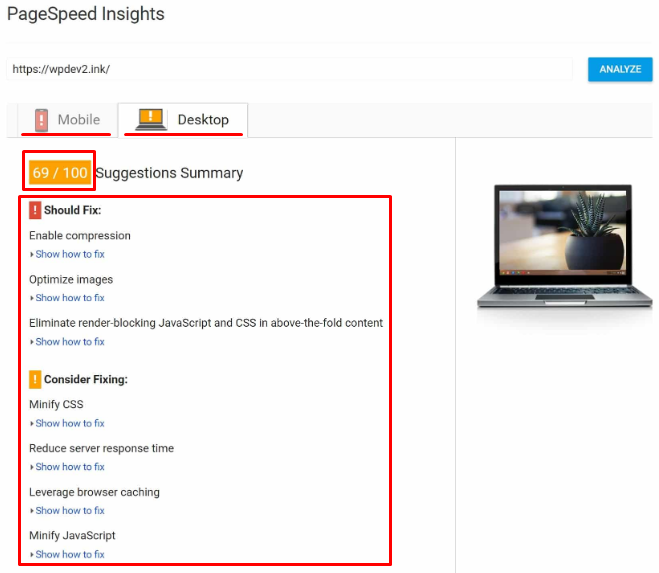
The easiest way is to use Google's tool PageSpeed Insights. The "Mobile" tab displays complete information about the loading speed and page weight distribution. In addition, the service indicates how image optimization for mobile devices on a particular website should be carried out:
Check the download speed on mobile computers and Google PageSpeed Insights
This is a ready-made guideline to follow that can be used step by step starting from the red zone.

You can also check page speed and receive recommendations on its optimization in Serpstat Site Audit tool. Go to Site Audit > All issues:
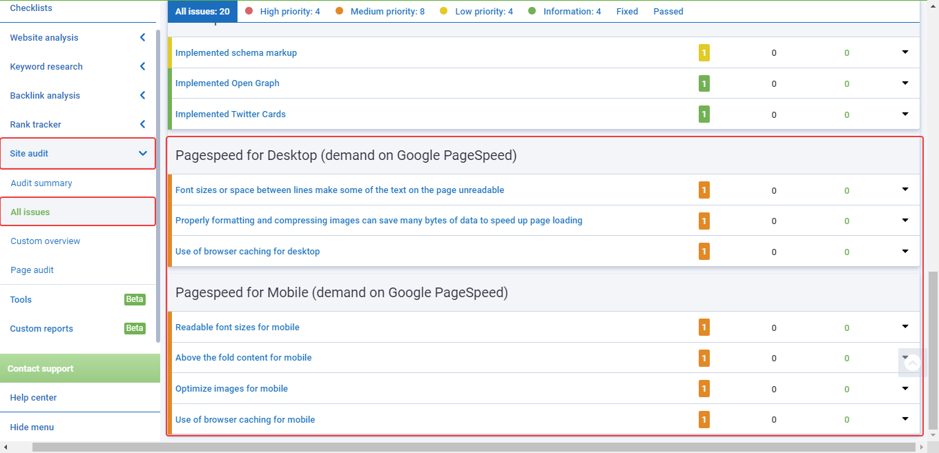
Check the download speed on mobile computers and Google PageSpeed Insights
Advanced SEO Audit: A Complete Guide To All Stages Of The Analysis [Infographic]

How to compress pictures for mobile devices

Find images that can be removed from a website without losing any value. Pay attention to such pages where heavy images surround fragments of text. Delete them, optimize or drag to the end of the page.

Imagine that a person is loading a page of a website on their mobile device. While pictures inserted in different sections of an article are loaded, the text automatically moves down the screen.

When scrolling a page, a user may accidentally click on a link that will move from another part of the page. As a result, a visitor will be annoyed not only by the long loading of a page but also by the text skipping over it. Therefore, you must not neglect image optimization.

What image formats are used on websites

It is currently recommended to apply the new image formats: JPEG 2000, JPEG XR, and WebP. Compression is more efficient, so they load faster and consume less traffic than PNG and JPEG images. Not all browser versions support new formats. You need to do a check before using them.

You can find standard image formats on different websites:

  • JPEG — photographs and images with smooth transitions of colors;
  • GIF — simple logos, signs, charts, diagrams, and animations;
  • PNG — signs, logos, and graphs with lots of shades;
  • SVG — individually developed logos and vector images.

All of these formats can be compressed using online tools and stationary programs as well as adding queries to the HTML code of a website.

Ways to reduce image size

1
Specify the image resolution. When uploading a picture to a page, you can specify the number of pixels, for example, 800x600 instead of 1200x800. But this size is still too large for a mobile device.

You can immediately upload thumbnails of images with the ability to enlarge to the maximum size when clicked to reduce the resolution. The easiest way to do that is via plugins, for example, Lightbox for WordPress.

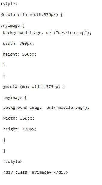
You can also set the size of the image in HTML using the query:
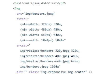
How to set image size in HTML
Depending on the width of a screen or a monitor, an HTML image is inserted with the dimensions specified in the code. This will happen when each image is added to a website. Here is the alternative code option for websites with the latest CSS installed:
How to specify image size in HTML for latest CSS versions
But what if all the pictures are already loaded and it is physically difficult to do everything manually? Use scripts in this order:

  • first, you need to collect all the styles:
module.exports in HTML code
  • reduce images specifying the desired size:
HTML image reduction
  • compress and move images to another directory:
HTML image compression
2
Compress images. This is done manually using online tools or stationary software. For example, Optimizilla or TinyPNG. Image compression for mobile devices can also be done via server commands:

For JPEG:

  • JpegTran eliminates metadata;
Deleting Metadata with the JpegTran Command
  • ImageMagic specifies the quality parameter for compression.
Image Compression ImageMagick
For PNG:

  • PngQuant compresses an image by reducing the number of shades. As a result, its quality is slightly deteriorating;
PngQuant Image Compression
  • PngCrush compresses an image and does not affect its quality.
PngCrush Image Compression
3
Activate Google developer mode — PageSpeed module which is suitable for Apache and Nginx servers and has a set of functions for optimizing images. You need to install and activate the module through this command:
How to enable PageSpeed on a server
4
Switch from the jQuery library to a lighter version. For example, Zeptojs. It makes no sense to use the old heavy library which puts additional load on mobile browsers.
5
Use data caching. After creating an image cache, each time you access the page, the browser will download the saved copies of the images without losing the time to download the original versions.
6
Refuse GIF animations that significantly slow down the page loading speed. If you need to use short videos in your text, use HTML5 which is supported by most modern mobile browsers.
7
Create CSS sprites of icons. In the usual format, downloading each icon means a separate request to the server. Creating combined sprites reduces the number of requests to the server and therefore reduces the page weight. Here is an example of a sprite:
CSS sprites of social media icons
Personal demonstration
Our specialists will contact you and discuss options for further work. These may include a personal demonstration, a trial period, comprehensive training articles, webinar recordings, and custom advice from a Serpstat specialist. It is our goal to make you feel comfortable while using Serpstat.

What is Responsive Web Design

Responsive Web Design is a single version of a website that automatically adapts to different devices. This is a simple resource design with a flexible image size, which varies depending on the device used.

RWD eliminates the need to create multiple versions of a website. In fact, responsive design is only useful when using modern devices with a high level of performance.

After configuring RWD, pictures automatically change their format within the screen. But the image weight on the server remains the same. A user with a powerful device and fast Internet connection will not see the difference.

If a person visits a website from a simple smartphone with a slow Internet connection, they will have to wait until the images, backgrounds, icons, and logos are fully downloaded from the server. So, you still have to manually reduce the pictures for mobile devices.

Conclusion

Image optimization for mobile devices means:

  • reducing their resolution;
  • compressing their size;
  • caching;
  • combining icons into CSS sprites.

If you do not resize images in HTML, the page weight will remain large. A user will have to wait a long time for the page content to load, and the search engine will decrease the ranking of such a site in the search results.

Use online services and server commands to automatically compress images. You can also use the Lazy Load effect of gradual loading when the text is displayed immediately and images are loaded as you scroll down the page.
This article is a part of Serpstat Site Audit tool
SEO Audit in Serpstat" title = "How to optimize images on a website for mobile devices 16261788347872" />
Conduct an audit of your site or page in one click and get a complete list of technical issues, ways to resolve them, and useful recommendations. Set up any convenient audit schedule and receive automatic email reports.
Run Site Audit

Speed up your search marketing growth with Serpstat!

Keyword and backlink opportunities, competitors' online strategy, daily rankings and SEO-related issues.

A pack of tools for reducing your time on SEO tasks.

Get free 7-day trial

Rate the article on a five-point scale

The article has already been rated by 0 people on average out of 5
Found an error? Select it and press Ctrl + Enter to tell us

Discover More SEO Tools

Tools for Keywords

Keywords Research Tools – uncover untapped potential in your niche

Serpstat Features

SERP SEO Tool – the ultimate solution for website optimization

Keyword Difficulty Tool

Stay ahead of the competition and dominate your niche with our keywords difficulty tool

Check Page for SEO

On-page SEO checker – identify technical issues, optimize and drive more traffic to your website

Share this article with your friends

Are you sure?

Introducing Serpstat

Find out about the main features of the service in a convenient way for you!

Please send a request, and our specialist will offer you education options: a personal demonstration, a trial period, or materials for self-study and increasing expertise — everything for a comfortable start to work with Serpstat.

Name

Email

Phone

We are glad of your comment
I agree to Serpstat`s Privacy Policy.

Thank you, we have saved your new mailing settings.

Open support chat
mail pocket flipboard Messenger telegramm