9879 10
Marketing 11 min read April 10, 2018

How To Create Responsive Emails Without Layout Designing Skills

How To Create Responsive Emails Without Layout Designing Skills
How To Create Responsive Emails Without Layout Designing Skills 16261788137307
Artem Chehovskoy
Blog Writer at UniSender
Let's try an experiment. Take your phone and open about 20 emails using your mobile mail app. How many pictures don't match the screen size? How many messages are in a too small font that makes you suffer from eyestrain? Is it always possible to get to the bottom of the email?
I faced at least one of similar problems in every third email. And I couldn't read any of them to the end. Could you?

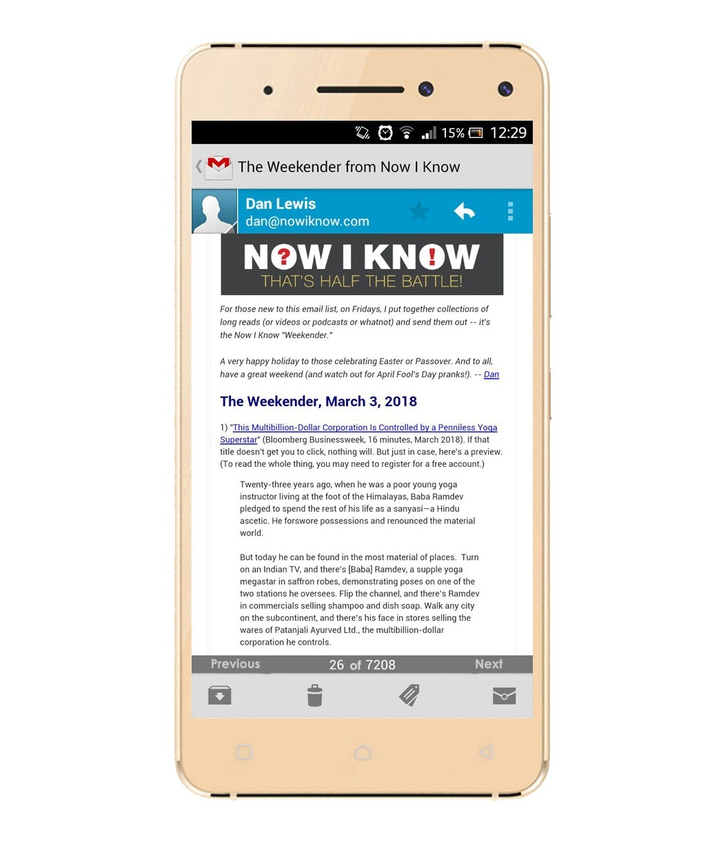
If you cannot properly read an email from your device it means it is not optimized for devices, i.e., it is not responsive. For example:
How To Create Responsive Emails Without Layout Designing Skills 16261788137308
'Now I Know' not responsive newsletter
Responsive email design provides a convenient reading from any device and through any application. HTML layout designers (markup specialists) rebuild emails for different platforms and screen resolutions using markup languages.

Why I need to know about responsive email design if I am not a layout designer?

Knowing the requirements for responsive email newsletters is useful not only for layout designers.

For example, email marketers take them into account when creating an email design. They pass two layouts to markup specialists: for PC and for devices. The layout has to be responsive, otherwise, it cannot be transferred to HTML and CSS.

A marketer should use this knowledge while creating terms of reference for designer and markup specialist and also to check their work after. It is useful even if you create templates in the email service block editor as you can make mobile-friendly emails without knowing any markup language.

Tools for responsive design creating

There are two tools to create a device-friendly email: media queries and fluid email design. Read about both below.

Media queries

Media queries are a component of CSS language which can be added to the HTML-code of the page. Queries act as a switch for triggering styles. They work when the screen width or orientation is changed. Queries increase font size, change colors, hide images, increase clickable area of buttons and links.

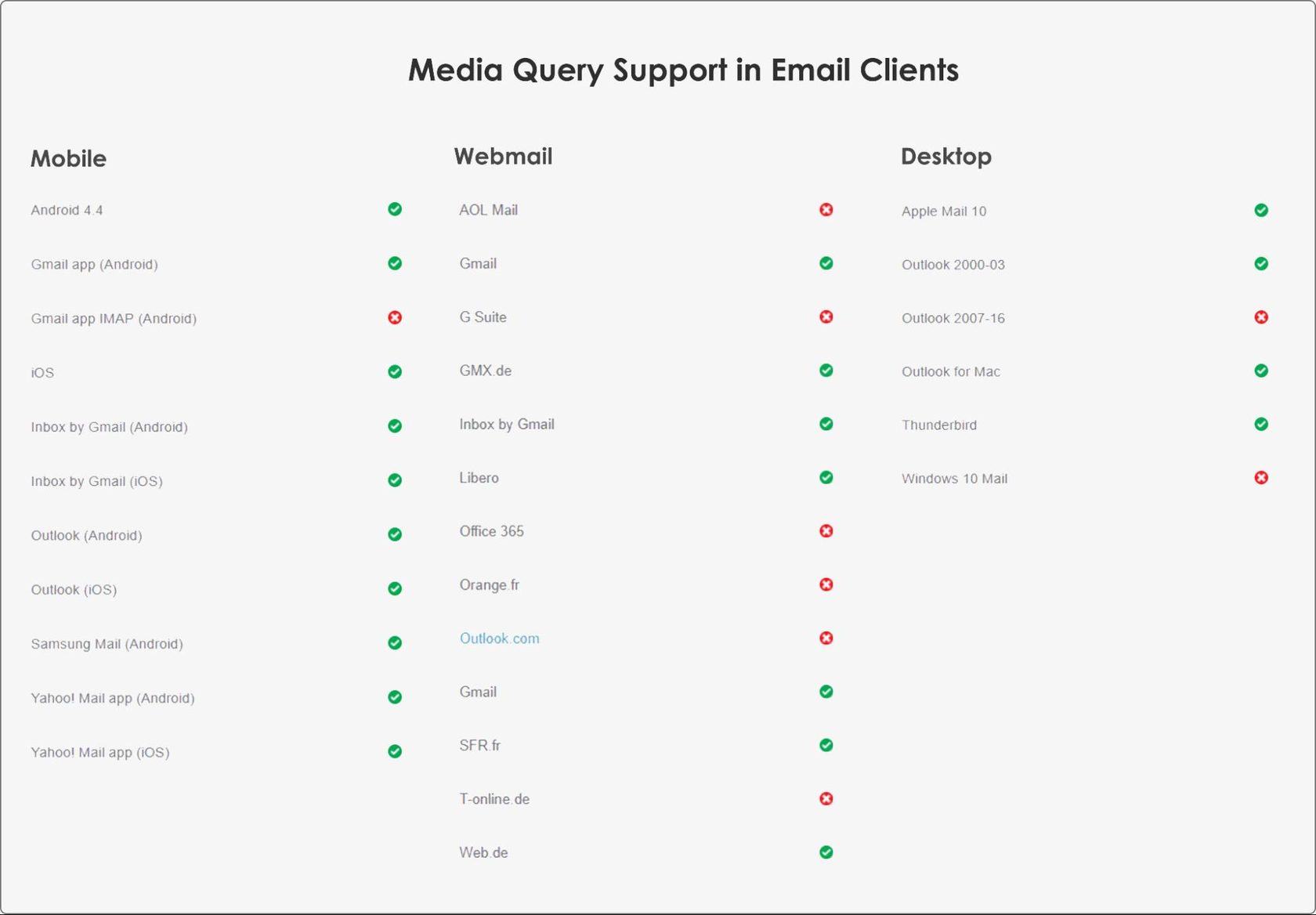
Not all clients/devices support media queries.The chart below outlines support for media queries across a range of email clients and applications.
How To Create Responsive Emails Without Layout Designing Skills 16261788137308
Media query support in Email Clients
In general, there are many questions around media queries. If you are not a layout designer, it's easier to create a design that will initially look good on both the PC and the mobile.
 

Fluid design

A message written in 2 or 3 columns is perfect for reading using computer. But if you reduce the screen size, there is no place for 2 columns. They shrink and it's not really comfortable to read the message. The fluid design turns a multi-column layout into a single-column layout. It is perfect for reading on your phone or tablet. Here's how the fluid design works:
If you reduce the viewing area 2 columns turn into 1
You can create a fluid design using source code editor or block editor. The second option is easier: no need to go deep into HTML and CSS, the templates have already been adapted to the changes of screen width.

DIY or give it to the markup specialist?

Markup specialist helps with the implementation of a typical or unusual solutions.

You need a specialist when capabilities of a block editor for mobile version are not enough. For example, if you want to rebuild your layout completely or when a customer has specific requests concerning mobile version. In other cases the capabilities of the block editor are sufficient.

To compose a letter like this one, you definitely need a specialist:
Columns in the email header, columns in the body, all columns are clickable, different background elements, many different links and buttons added
Such one can be made up in a block editor:
Simple template, no fantasy fonts, no elements overlapping

Creating a responsive letter in a block editor

A mailing service always has a built-in block editor. It works on the Drag & Drop principle. Select the desired block and drag it directly to the right place on the editor. Next step is customizing. You can freely insert pictures or text, change the size, add tags and links.

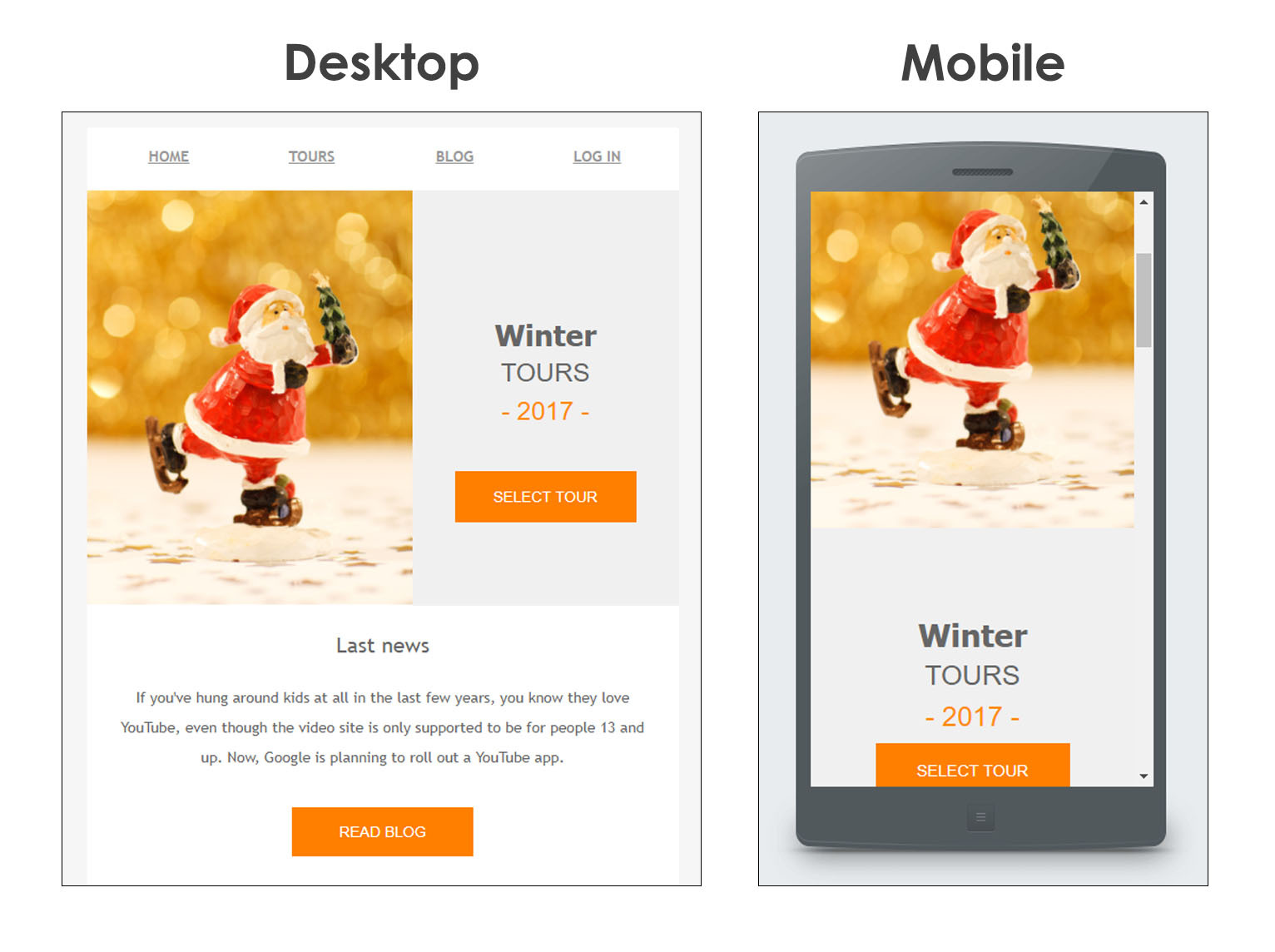
Block editors work on fluid design principle. If there are two or more horizontal blocks standing in one line on the desktop, the second block (and every other) jumps under the first one on the mobile device. Have a look at how it works in Unisender editor:
How To Create Responsive Emails Without Layout Designing Skills 16261788137309
In mobile mail app text shifted under the Santa image
However, you cannot change font, idents, images sizes in a template and you cannot know how exactly your email will look on different devices. If you want your letter look perfect and be all-device friendly, make it responsive initially. Here are some rules.

6 rules of responsive email designing

1
One column is better than many.

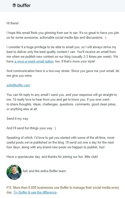
The more columns — the smaller the font. We want our subscribers to be happy and don't suffer from eyestrain. Most newsletters are written in 1-2 columns that provides a comfortable reading on desktops and devices.
How To Create Responsive Emails Without Layout Designing Skills 16261788137309
'Buffer' one-column newsletter
How To Create Responsive Emails Without Layout Designing Skills 16261788137310
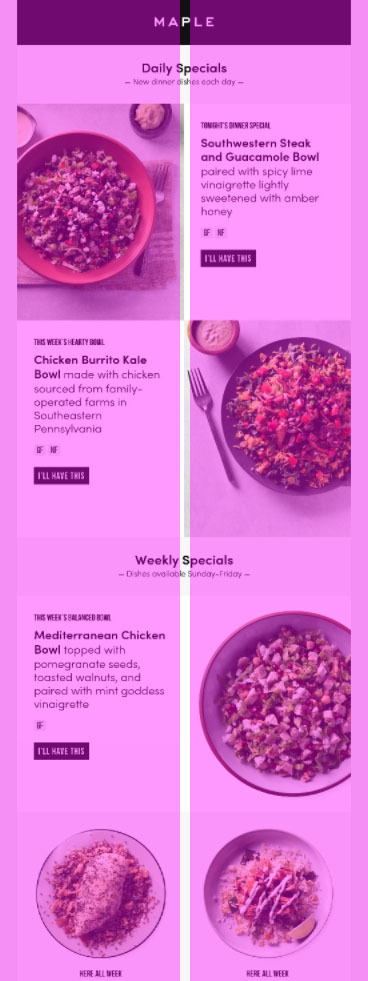
'Maple' email is divided into two columns by modular grid
2
Minimal design

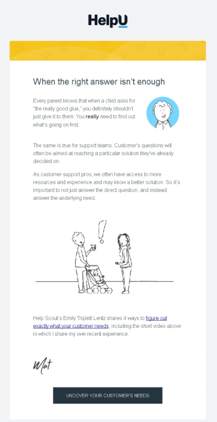
To speed up your email load time and simplify the process of making it responsive try to use 2-3 main colors in your newsletter. Also minimize a number of images, font and background changings.
How To Create Responsive Emails Without Layout Designing Skills 16261788137311
'HelpU' newsletter: limited number of images, the same font for all the text, only header and links are emphasized
3
Huge buttons and links

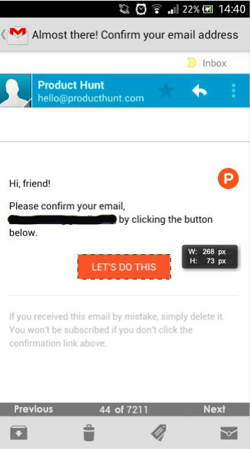
Apple guidelines recommend the size of the clickable area of a button or link to be not less than 44х44 pixels. If you prefer your subscribers press the button use this size.
How To Create Responsive Emails Without Layout Designing Skills 16261788137311
Button size 73х268 px. No failure in hitting.
4
Easy-to-read font

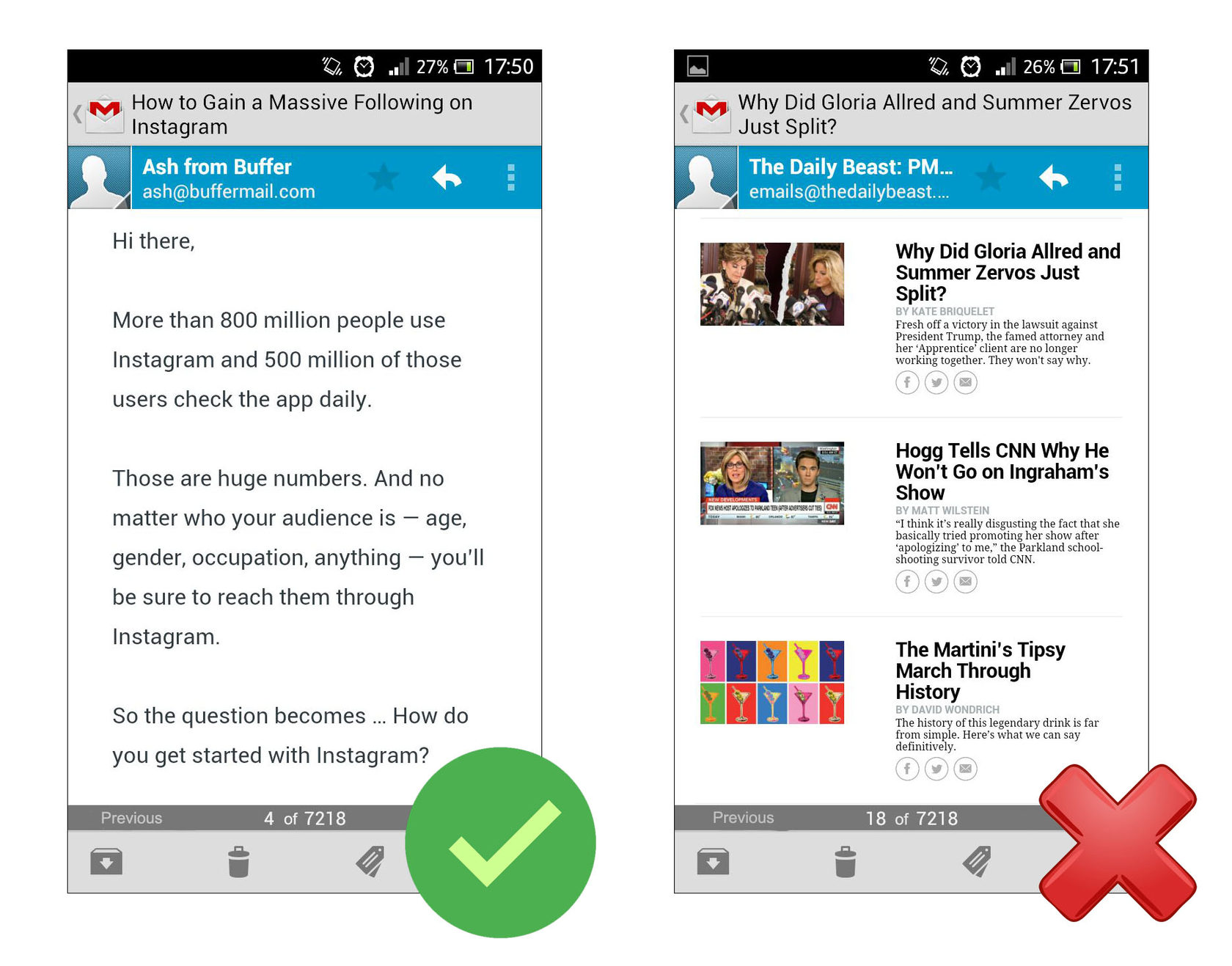
Apple guidelines also recommend font for emails read on devices to be not less than 13 px. If you want to take chances out and insert 11 px or 12 px text IOS email app will increase font size by default.
How To Create Responsive Emails Without Layout Designing Skills 16261788137312
An email about 'massive following on Instagram' is optimized for devices. Newsletter from 'The Daily Beast' is created for eyestrain fans.
5
Fewer fantasy fonts

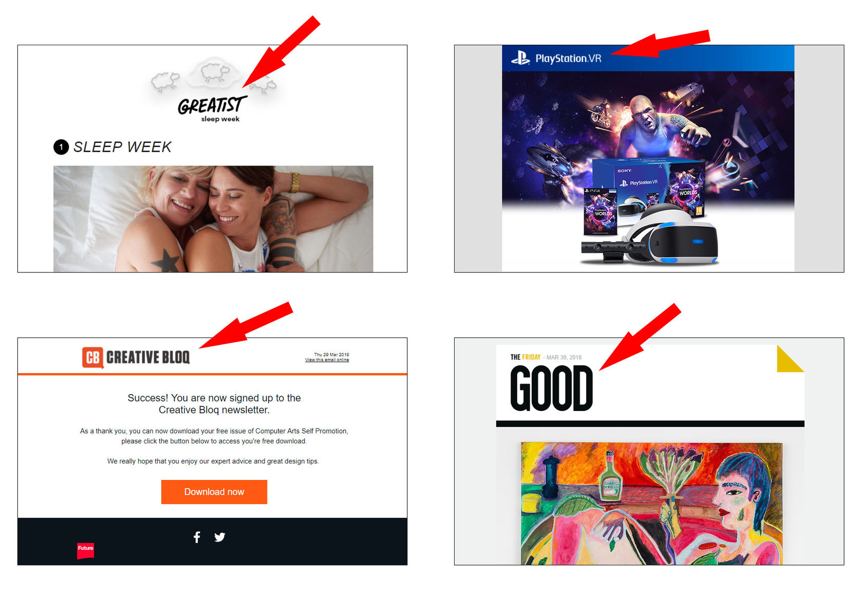
Most often fantasy fonts are inserted in the form of images. When you open such email from a device, the text is scaled to the size of the screen or offers horizontal scrollbar. That is not readable.
How To Create Responsive Emails Without Layout Designing Skills 16261788137312
Headers are inserted in the form of images
6
Brief and to the point

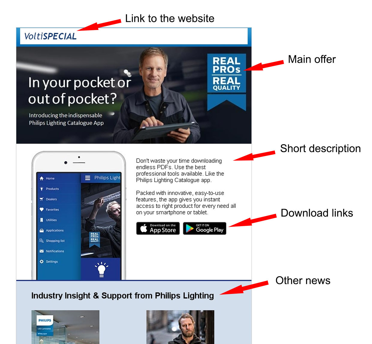
Use screen space efficiently. Place important content, call-to-action buttons and links on the top of it.
How To Create Responsive Emails Without Layout Designing Skills 16261788137313
'VoltiSpecial' fit in important content on the top of the message

How to check whether your email is responsive

You may use email preview function in your mailing service. But testing in mailing service doesn't guarantee that email will look exactly the same on all devices.

To be sure your email is responsive now you may send it to different mail system addresses. If you don't have different systems mailboxes – you'd better create it.

Check if the email is designed and coded right. Read it first using a desktop, then both Android and IOS devices. If you don't have one of the devices ask friends and check it anyway.

If whatever the reason testing your email message in mailing service is not possible you may always use HTML email check.

Or you may use one of the email testing services and check email responsiveness. It shows how the email looks in different browsers, mail apps, and devices with different resolutions. Sometimes there is no need to pay money for a subscription, for instance, Litmus starts monthly fee from 79 $ and Email On Acid from 44 $.

Most HTML layout designers have the subscription so that ordering an email you may ask them to provide you with screenshots of testing results.

Things to remember

1
Knowing requirements for responsive emails is useful not only for layout designers but for marketers and email makers.
2
You need a layout designer to compose atypical emails. Otherwise, block editor is enough.
3
There are two tools for responsive email implementation - media queries and fluid design. If you need queries - go to a layout designer; fluid design is built in the most block editors.
4
Choose easy-to-read font, use minimal design and place most important buttons and links on the top of the message.
5
Send the email to your mailboxes and try to open it in different browsers and mail apps to check the email responsiveness.
6
Layout designers often have rights for responsive design testing in mailing services. If you outsource making a responsive design, then ask screenshots from Litmus or Email On Acid.

Speed up your search marketing growth with Serpstat!

Keyword and backlink opportunities, competitors' online strategy, daily rankings and SEO-related issues.

A pack of tools for reducing your time on SEO tasks.

Get free 7-day trial

Rate the article on a five-point scale

The article has already been rated by 1 people on average 5 out of 5
Found an error? Select it and press Ctrl + Enter to tell us

Discover More SEO Tools

Domain Analysis Tools

SEO Domain Analysis – gain insights into your website's strengths and weaknesses

URL Inspection Tool

Uncover hidden SEO opportunities with our powerful URL Inspection Tool

Keyword Rank Checker

Google Keyword Rankings Checker – gain valuable insights into your website's search engine rankings

Competitor Website Analytics

Complete analysis of competitors' websites for SEO and PPC

Share this article with your friends

Are you sure?

Introducing Serpstat

Find out about the main features of the service in a convenient way for you!

Please send a request, and our specialist will offer you education options: a personal demonstration, a trial period, or materials for self-study and increasing expertise — everything for a comfortable start to work with Serpstat.

Name

Email

Phone

We are glad of your comment
I agree to Serpstat`s Privacy Policy.

Thank you, we have saved your new mailing settings.

Report a bug

Cancel
Open support chat
mail pocket flipboard Messenger telegramm